CE × WFP

WFP should be able to communicate at the scale of its mission.

Curious Endeavor builds communications infrastructure for global institutions.
Scroll
318M
people facing acute hunger — WFP 2024

The world's largest humanitarian organisation deserves communications that match the scale of its operations.

Fig 0.1 — The landscape
41
Simultaneous crises
OCHA coordinated 41 response plans across 72 countries in 2024. Donors face what researchers call pseudoinefficacy — feeling their contribution is a drop in the ocean. The clearest voice wins. Source
43%
Donor retention
The sector average. Fifth consecutive year of decline. New donor retention is just 19%. Even when people give, they don't come back — unless the brand relationship holds. Source
–2.4%
Individual giving
US individual giving fell 2.4% in real terms in 2023 — while 323 million people needed help. The gap between need and funding is widening from both sides. Source
Fig 0.2 — The opportunity

Your donation page undersells the mission. Your YouTube has 76K subscribers — for a Nobel Peace Prize laureate assisting 124 million people. Regional offices in Dakar and Nairobi produce communications at completely different standards. ShareTheMeal reaches 2 million supporters through an app that hasn't been visually refreshed since 2017.

None of this is a talent problem — the "Empty Feed" Ramadan campaign proved your teams can produce world-class creative. The problem is infrastructure: no system that ensures consistency across 120 offices, no production pipeline connecting research to editorial to visual, no external creative partner since 2019. We build that layer. Your team directs.

WFP Empty Feed Ramadan campaign — empty bowl
"Empty Feed" — WFP Ramadan 2021. Internally originated, culturally resonant, award-winning.
48hrs
brief to first intelligence output
12
audience registers, one pipeline
3
disciplines. Zero handoffs.
01 Social Intelligence

Know the landscape before you write the first line.

Within 48 hours of a brief, your team receives a complete narrative intelligence package — cultural context, audience language, media gaps, and trend signals across every relevant region and language.

Voice System
02 Voice System

One editorial standard. Every office. Every language.

Your guidelines, your tone, your institutional voice — encoded into a system that ensures consistency whether the output is in English, French, Arabic, or Spanish. Field officers produce headquarters-quality communications from day one.

03 Visual Intelligence

Dignified. Purposeful. Consistent across every region and format.

Visual editorial standards built on your existing brand identity. Photography direction that moves beyond crisis imagery toward dignity and agency. A system your partners, field teams, and regional offices can use immediately.

What comes out
of the engagement.

Fig 0.3 — What you get
01
Social Intelligence

Know the landscape before you write.

  • Cultural intelligence brief
  • Audience language map
  • Narrative gap analysis
  • Regional comparative report
  • Platform-by-platform narrative scan
  • Hunger map data brief
02
Message Architecture

One editorial system. Every audience. Every language.

  • Voice & tone guide
  • Message hierarchy framework
  • Headline variant set (x40, multilingual)
  • Register matrix per audience
  • Emergency appeal template
  • Donor communication system
03
Visual Intelligence

Visual standards your whole network can use.

  • Visual style definition
  • Photography direction brief
  • Branded image system
  • Visual QA protocol
  • Dignity standards document
  • Partner usage guidelines
12 days, brief to first output
18 discrete deliverables
1 integrated pipeline, not three vendors

From live data to
ready-to-publish output.

Fig 0.4 — Hunger Map pipeline
WFP Hunger Map
Live data — 90+ countries, real-time food security monitoring, IPC classifications, population displacement, supply chain status
01 Ingest
System pulls current hunger map data, cross-references with WFP operational reports and regional bureau feeds. Country-level and regional aggregation.
02 Contextualise
Data mapped against narrative context — media coverage, donor sentiment, campaign calendar, regional comms gaps. Numbers become stories.
03 Produce
Outputs generated against your brand guidelines, editorial voice, and visual identity. Every piece traceable to approved standards. Human review before publish.
What comes out
//
Intelligence brief
48-hour research brief with data-backed narrative angles, regional priorities, and comms recommendations.
"IPC Phase 4 confirmed in 3 new regions — donor comms window opening"
Aa
Social content
Platform-ready posts with data visualisations, stat cards, and copy variants across languages. Branded, on-voice.
"318M people face acute hunger. That number moved by 12M this quarter."
[]
Donor pages
Landing page content blocks with live-data proof points, urgency framing, and impact stats tuned to convert.
"Your $0.50 feeds one person for one day. 47M need it today."
>_
Crisis templates
Pre-drafted emergency comms with current data pre-filled. Field offices publish in hours, not days.
"Famine confirmed in [region]. WFP is on the ground. Here's what we need."
Fig 0.5 — Regional analysis

Comparative communications audit across regions

One of the first outputs: a structured comparison of communications quality across WFP regional bureaux. This example shows the kind of gap analysis your team receives — identifying where standards hold and where intervention is needed most.

Regional Bureau — West Africa
Dakar (RBD)
Website consistency 4.2 / 10
Social media alignment 3.8 / 10
Photography standards 5.5 / 10
Multilingual coverage FR only
Message coherence Fragmented
vs
Regional Bureau — Eastern Africa
Nairobi (RBN)
Website consistency 7.8 / 10
Social media alignment 7.2 / 10
Photography standards 8.1 / 10
Multilingual coverage EN + local
Message coherence Aligned

This is what the system produces in its first 48-hour cycle: a scored, actionable comparison across every dimension of regional communications — websites, social channels, traditional media presence, photography quality, and editorial alignment. Your team sees exactly where to focus first.

Relevant work

Fig 0.6 — Portfolio

We've designed for two of the world's most serious global institutions — both dealing with multi-region, multi-audience, data-heavy content that needs to feel authoritative without being inaccessible.

Atlantic Fellows

Global leadership network across 90+ countries. Research, editorial voice, and visual identity — where consistency across regions is the central challenge.

View live site
Scroll to explore
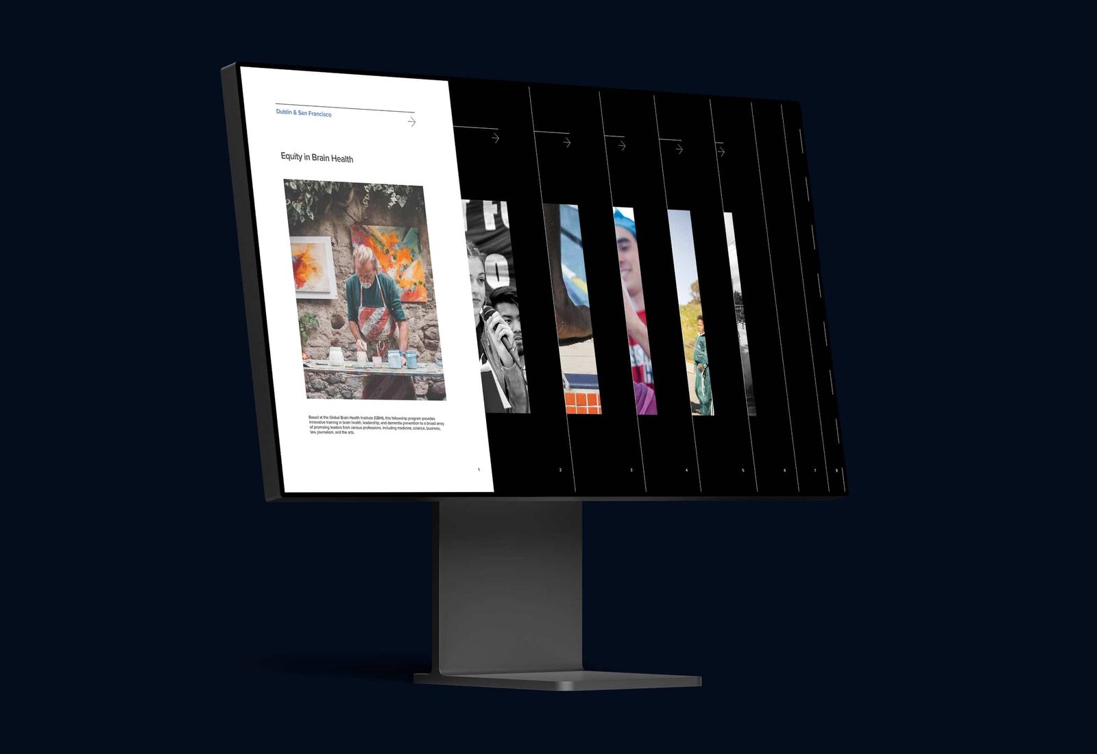
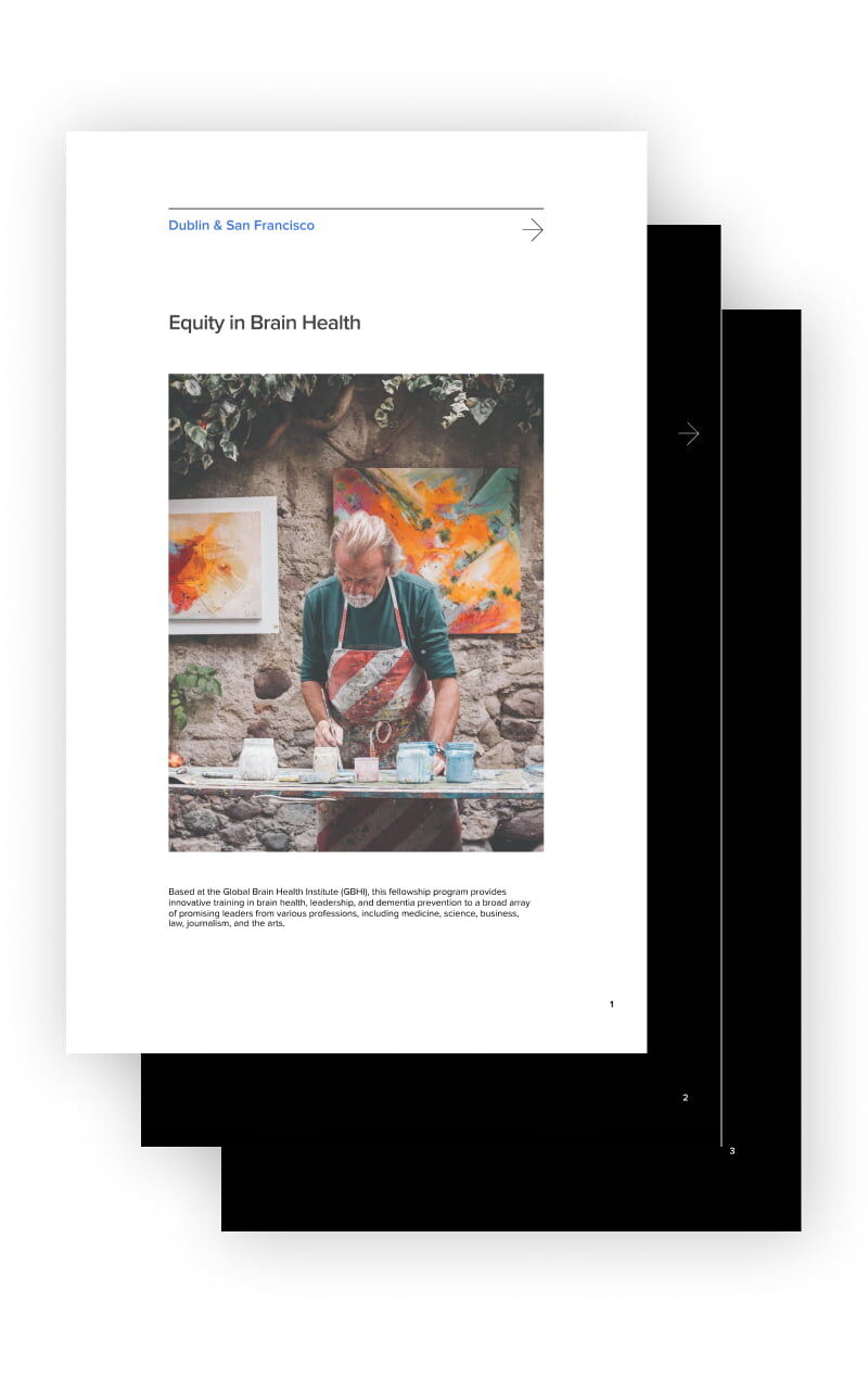
Atlantic Fellows — programmes interface
Programmes
Seven global programmes, one design system — regional stories at scale
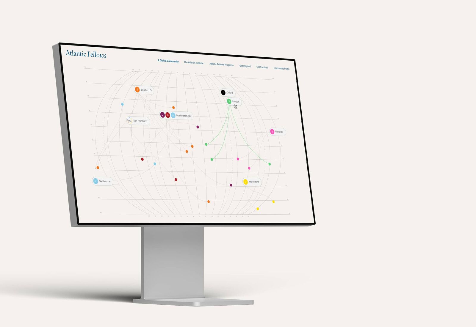
Atlantic Fellows — interactive global map
Global mapping
Interactive map — fellows, projects, communities across 90+ countries
Website animation
Color-coded data visualization connecting programmes, people, and regions
Atlantic Fellows — editorial system
Editorial system
Bold typography, precise economy of words — one voice across every programme
Global mapping
Interactive map across 90+ countries. Same architecture as the Hunger Map pipeline we're proposing.
Regional consistency
Seven global programmes, one visual and editorial standard. The exact challenge across WFP's 120+ offices.
Brand voice
Institutional tone that balances impact with restraint. Dignified storytelling without overstatement.
Data as narrative
Turning complex programme data into visual stories. Numbers become context, not just statistics.

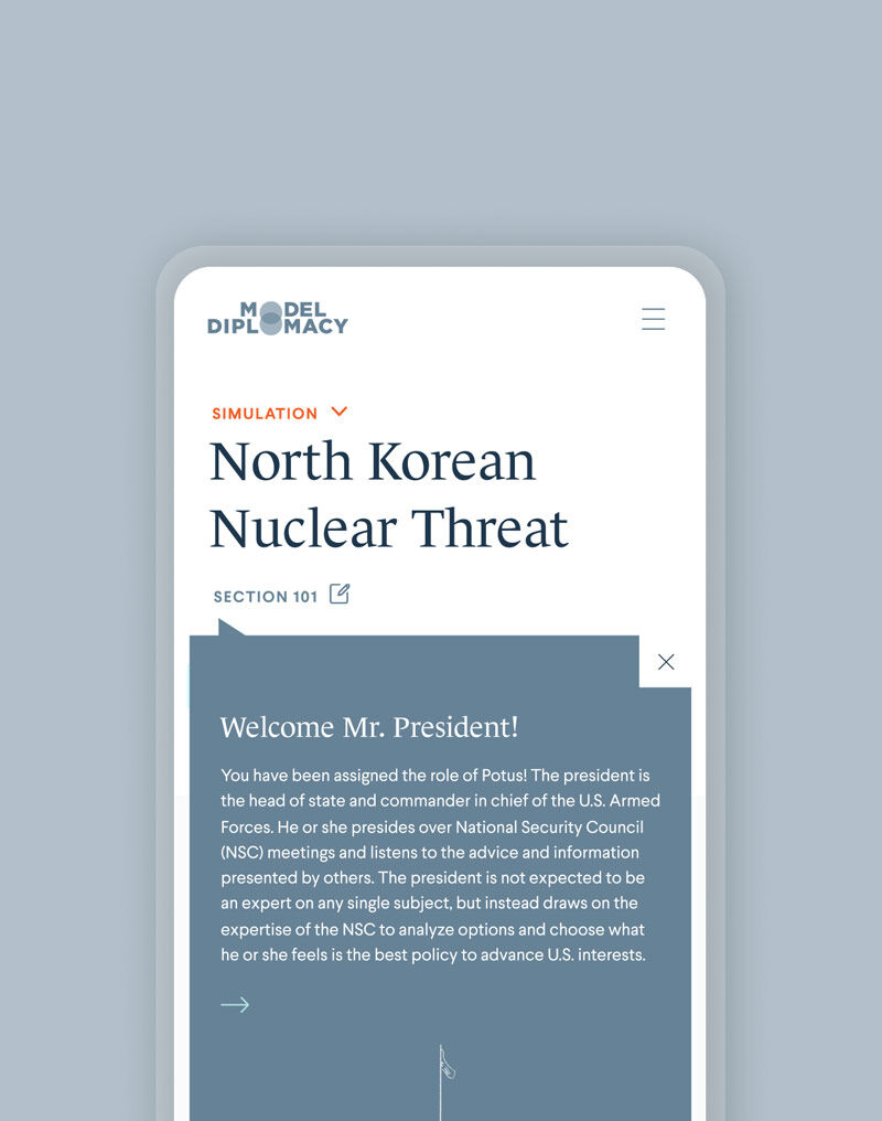
Council on Foreign Relations

Non-partisan foreign policy think tank. Simulation platform turning complex global affairs into accessible, multi-audience experiences.

View live site
Scroll to explore
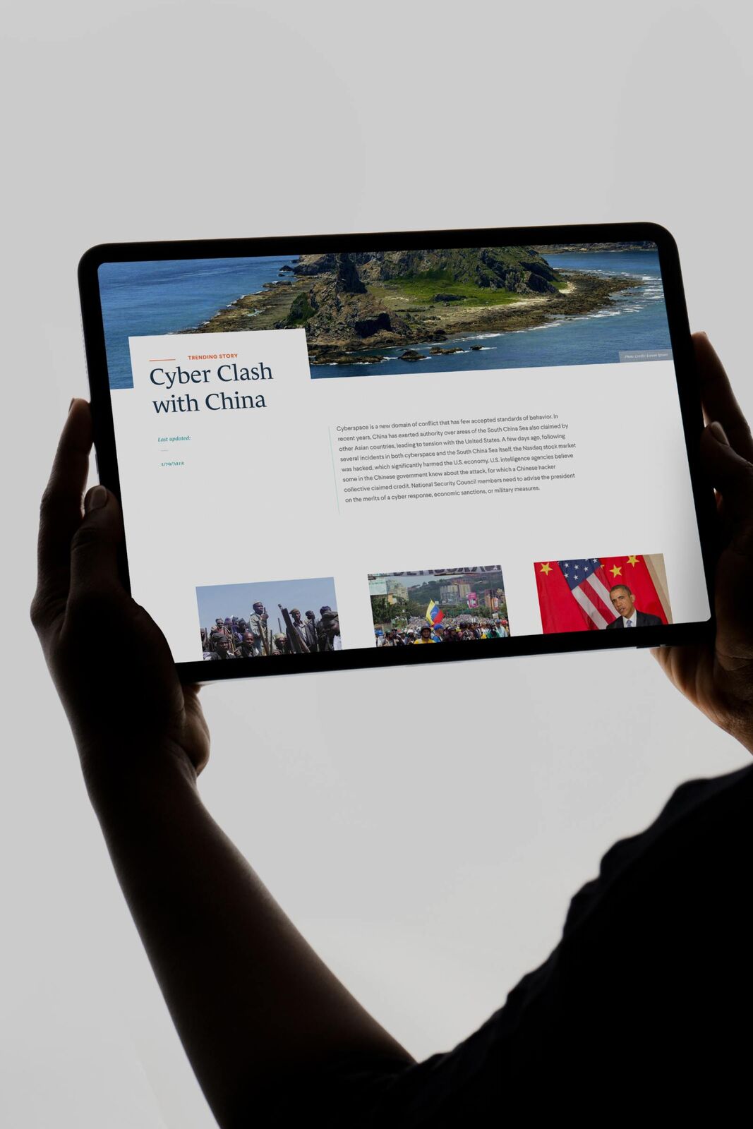
CFR — platform overview
Platform
Complex global affairs, simplified into an accessible interface
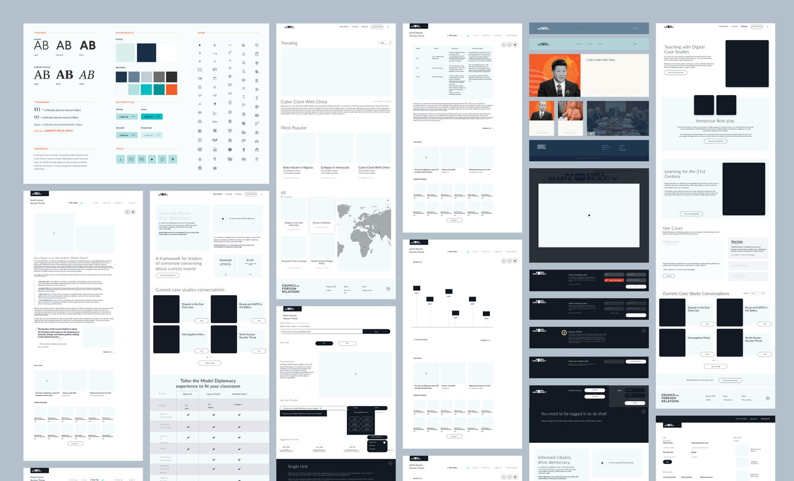
CFR — Model Diplomacy platform screens
Model Diplomacy
Multi-screen simulation platform — policy education at scale
CFR — data and policy visualization
Data layer
Policy data made visual — the same challenge as hunger map communications
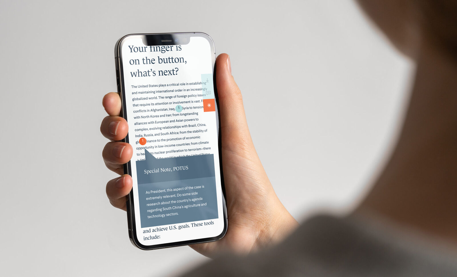
CFR — detail view
Detail
Institutional credibility preserved at every scale
Institutional tone
Designed for one of the world's most respected policy institutions. The same authority and restraint WFP requires.
Complex → accessible
Turning dense foreign policy data into intuitive experiences. Same challenge as hunger map to donor page.
Multi-audience
Students, educators, policy experts — one platform. Mirrors WFP's field offices, donors, media, and HQ.
Research-first
Months of user research before a single pixel. Intelligence before the brief — exactly what we're proposing.

How the engagement works.

Fig 0.7 — Engagement
01
Audit
Full communications audit across regions, channels, and languages.
We analyse your 120+ country offices, social channels, website, donation flow, and editorial output. You receive a scored gap analysis with specific recommendations — like the Dakar vs Nairobi comparison above, but across every bureau.
Weeks 1–4
02
Build
Production system built around your guidelines and voice.
Your brand standards, editorial voice, and institutional knowledge become the foundation. We deliver the 18 deliverables across research, copy, and visual — each traceable to your approved guidelines. On-premise deployment available.
Weeks 5–12
03
Operate
Continuous production. Your team directs, the system delivers.
Ongoing content production, campaign support, and real-time intelligence from the Hunger Map pipeline. Every cycle tightens the guidelines. Quality compounds. Vendor relationship — no headcount required.
Ongoing

First deliverable lands in two weeks. Full system operational by week twelve. Multilingual across English, French, Arabic, Spanish, and Portuguese from day one.

We believe this might be the most important brief in the world.

CE × WFP — 2026