§01
"Notion crossed 100M users in 2024 with 80% outside the US — a radically international brand growing into an AI-era all-in-one platform. With $500M ARR and no IPO pressure, they're investing in brand as competitive moat."
§02
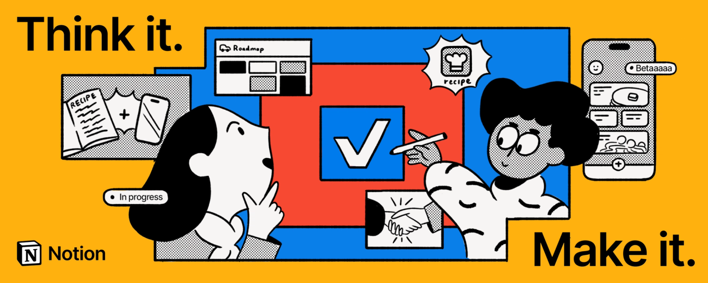
Notion started as a note-taking app but has engineered its positioning across three distinct eras: personal productivity tool → team workspace platform → AI-powered thinking environment. The "Think it. Make it." tagline marks the third era — a deliberate shift from feature-led messaging to emotion-led identity. The campaign doesn't sell features; it sells the feeling of flow.
"We wanted to bottle up that feeling [of enlightenment] and bring the viewer into the minds of knowledge workers everywhere — illustrating how Notion can make sense of our beautifully complex lives, becoming a playground for work or play." — Ben Langsfeld, Chief Design Officer, BUCK
Their current strategic bet: own "AI-augmented clarity." While Notion AI launched in 2022, the visual and narrative repositioning in 2024 reframes the entire product around what it unlocks — reclaimed time for the creative work that actually matters. They're not selling a tool; they're selling back your attention.
§03
§04
Notion runs a split system. The core product is almost achromatic — warm near-black on white, with the full spectrum reserved for database tags and content types. The campaign layer breaks entirely from this: BUCK's "Think it. Make it." palette deploys primary red, blue, and yellow at full saturation, creating a visual tension between the humble utility product and the bold brand identity. Two palettes, one brand.
§05
§06
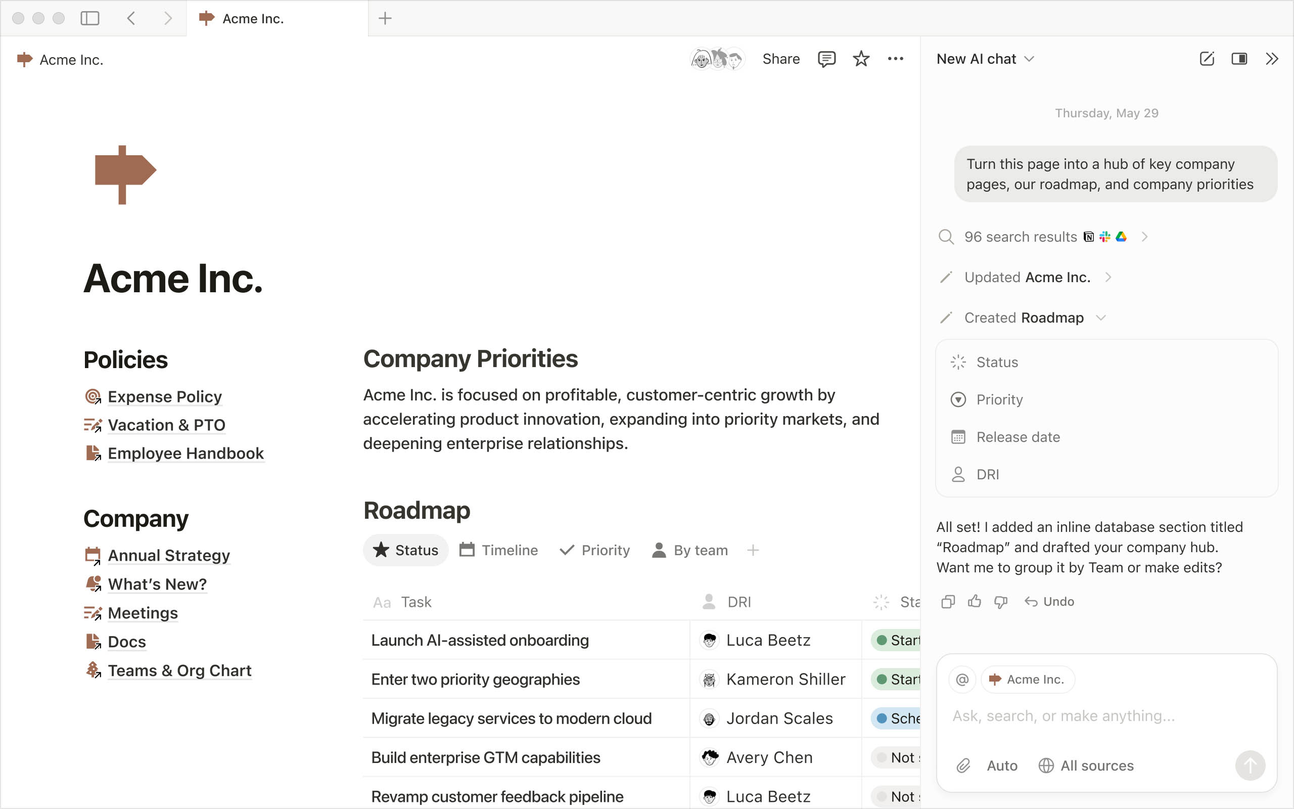
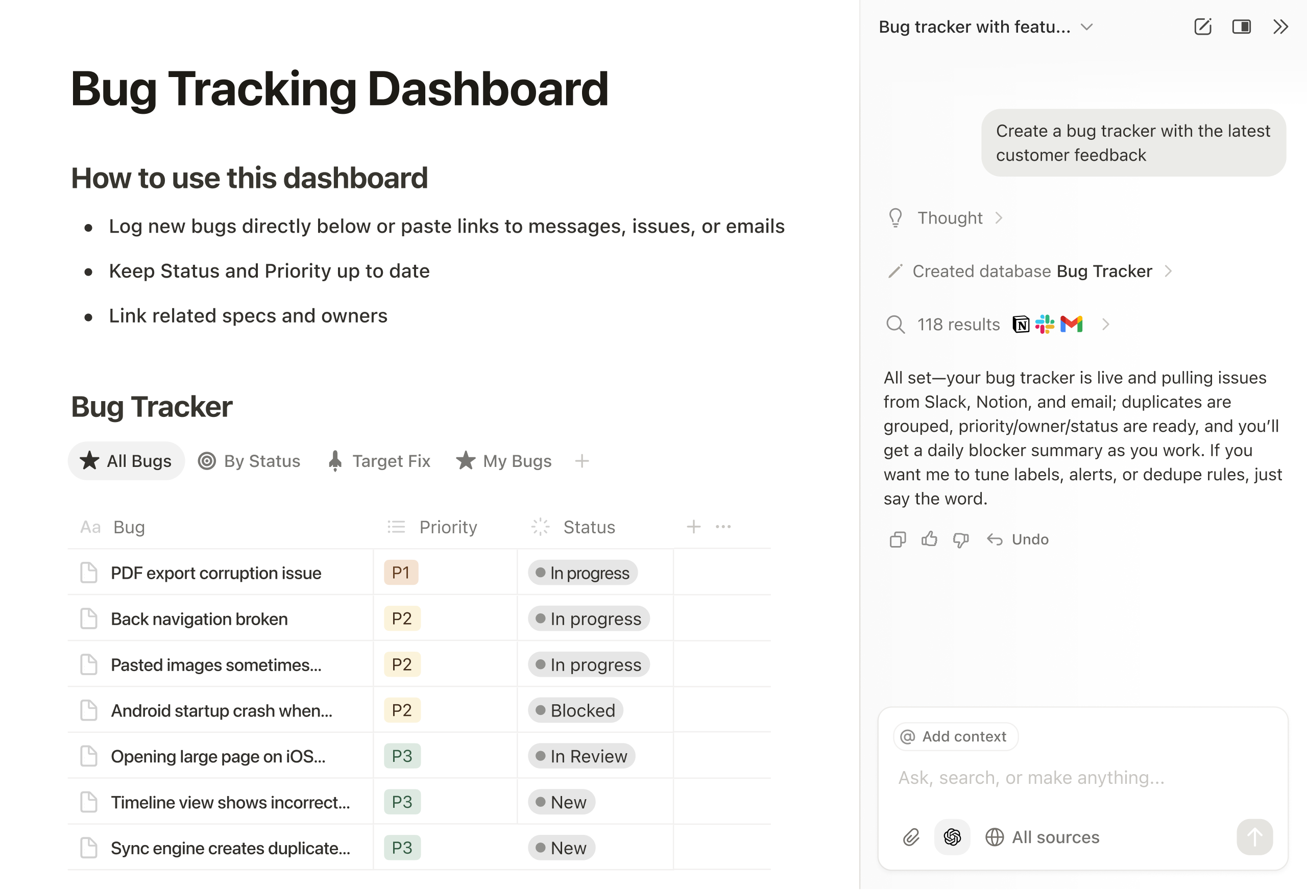
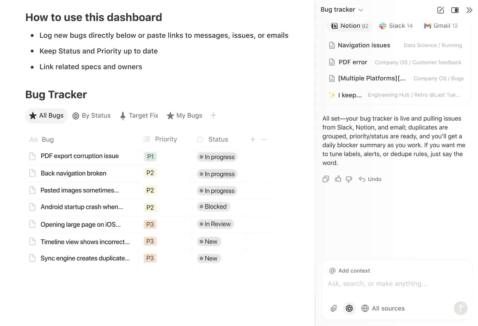
Notion's digital experience is deliberately understated. The product UI is a blank canvas — the chrome disappears and the content takes over. This is a philosophical position: the tool should be invisible. Their marketing site mirrors the same restraint, breaking only where AI features need demonstration.
§08
Notion's second global brand campaign, timed to the launch of its AI features. BUCK worked with Head of Creative Rob Giampietro and long-time illustrator Roman Muradov to zoom in on characters — literally — getting inside their heads to visualize the thinking-to-making loop. The visual shift was deliberate: away from their minimalist default (which got lost on OOH globally) toward bold primary colors, halftone textures, and heroic-scale character illustrations. Ran across 7 global cities: San Francisco, New York, London, Paris, Seoul, Tokyo, Berlin. 460 million impressions. Significant first-visit spike in all key markets.
Notion's first international brand campaign. The objective: reframe Notion from individual tool to team platform. Instrument built a scalable design system around emotionally resonant stories of individuals using Notion for both professional and personal goals. 1.5 billion impressions across 8 cities. OOH, connected TV, digital billboards, metro ads, kiosks, social. Won Drum Awards OOH Campaign of the Year 2022. The campaign set a high water mark for how a productivity tool can tell human stories without betraying its functional DNA.
§09
Notion has one of the most active user communities in SaaS — a creator ecosystem of template sellers, YouTube educators, and aesthetic workspace enthusiasts that generates massive organic reach. 80% of their 100M+ users are outside the US, making them a genuinely global brand in a way most SaaS companies are not.
The most remarkable thing about Notion's community: it built itself. The template economy, the YouTube tutorials, the aesthetic workspace culture — none of it was engineered. It was created by users who found meaning in customizing their environments. Notion's job is to not ruin it.
More from BUCK — Notion "Think it. Make it." 2024
§10
| Dimension | Rating | Notes |
|---|---|---|
| Brand Identity | Strong | Dual-mode identity works — minimal product skin + bold campaign layer. Illustration system by Muradov is genuinely distinctive. |
| Campaign Work | Strong | Two international campaigns in three years, both award-quality. BUCK's "Think it. Make it." is a benchmark for how SaaS can do brand. |
| Digital Product UX | Strong | Block editing is the industry reference point. Clean, fast, infinitely flexible. AI integration is seamless. |
| Community & Creator Ecosystem | Strong | Self-sustaining creator economy. Template marketplace. Ambassador program. Organic social reach is 10x their owned channels. |
| AI Integration | Strong | Notion AI deeply embedded — summarize, generate, query databases. Ahead of most competitors on AI-native UX. |
| Typography System | Strong | NotionInter is purpose-built for the product. No display font needed — size does the work. |
| Social Presence (Owned) | Mixed | Owned channels are modest for their scale. They rely on creator amplification. TikTok and YouTube native content is underdeveloped. |
| Enterprise Positioning | Mixed | Individual/student roots make the enterprise pivot awkward. Competitors with cleaner enterprise lineage win procurement more easily. |
§11
§12
The Sage-Creator hybrid. They don't tell you what to do — they give you the tools and trust your intelligence. The BUCK campaign leans into the Creator: play, imagination, making. The product leans into the Sage: structure, clarity, control. The tension between these two is the brand's most interesting quality.
Understated. Confident without being loud. Enabling, not prescriptive. When they use words, it's economical — the "Think it. Make it." tagline is 4 words that do the work of 40. Product copy is invisible by design. Marketing copy is human and warm. Never hype-driven, never feature-laundry.
Using Notion signals: I am thoughtful, organized, and creative. I take my work seriously but not myself. I value structure and flexibility equally. It's a workspace tool that functions as identity marker — particularly among designers, writers, students, and knowledge workers who care about how they work.
§13
| Dimension | Notion | Curious Endeavor |
|---|---|---|
| Brand Positioning | AI-era all-in-one workspace. "Think it. Make it." | Strategic creative agency. Culture + Commerce. |
| Visual Identity | Dual system: minimal product + bold campaign. Illustration-driven. | Larken editorial system. Red/black. High information density. |
| Typography | NotionInter — functional, invisible, neutral. | Larken (display) + Inter (body) — editorial presence. |
| Campaign Strategy | Emotion-over-features. Global OOH + digital. | Intelligence-led creative. Brief-to-brand strategy. |
| Community | 100M users, creator ecosystem, template economy. | Client-centered, selective, relationship-first. |
| AI Integration | Native AI throughout product and brand story. | AI as creative infrastructure — subagents, automation, speed. |
| What CE Can Learn | Illustration as brand differentiation. Dual-mode identity systems. Letting campaign language breathe beyond the product. | — |
| Where CE Wins | — | Sharper editorial voice. More muscular typography. CE's approach has more strategic ambition per page. |
Notion is the benchmark for how a tool brand can transcend its category. The lesson for CE: brand campaigns can be emotionally resonant without abandoning intelligence. Their dual-identity system — minimal product, bold campaign — is a model worth studying for CE clients who live in both spaces.
§07
Social Strategy
Notion's social presence is community-amplified more than platform-native. Their own channels are modest by enterprise SaaS standards — but the creator ecosystem around them (Notion influencers, template sellers, YouTube tutorials) generates the kind of organic reach most brands buy. Their owned content leans into product education and aesthetic appeal.
Content pillars: product education (35%), community highlights (25%), campaign/brand moments (20%), creator spotlights (15%), AI tips (5%). Their biggest growth lever is user-generated: the aesthetic "Notion setup" trend on TikTok and YouTube has spawned thousands of creator videos without any paid activation. Instagram content skews to minimal, aesthetic workspace shots — highly shareable among design-adjacent audiences.