01 — Overview
The World's Largest Humanitarian Organization. Underbranded.
WFP is a 2020 Nobel Peace Prize laureate that fed 124 million people in 87 countries last year.
Its brand communications trail its operational scale by at least 5 years — creating a genuine
opportunity for a creative partner who understands both humanitarian complexity and modern brand systems.
318M
People facing acute hunger globally
120+
Countries and territories with WFP presence
54%
Of funding target actually received in 2024
314M+
Meals shared via ShareTheMeal app
WFP received $9.8B in contributions in 2024 — but that's only 54% of its stated $18.2B operational need.
The 2025 USAID crisis (effectively a 35% budget cut from one source) has pushed WFP into an existential
funding squeeze. New donor audiences, better conversion, and modern brand credibility are now operational
priorities — not just communications niceties.
WFP operates as two distinct brand worlds: the global UN institutional brand (wfp.org) and
the US fundraising affiliate WFP USA (wfpusa.org), which is 3+ years more modern in execution.
A third brand, ShareTheMeal, operates as a semi-independent product brand. This fragmentation
is the central strategic challenge.
Key Context — 2025
USAID's near-total dismantling in early 2025 removed ~$60B from the global aid ecosystem.
WFP's projected 2025 resources dropped from $9.8B to ~$6.4B — a 35% fall. This is forcing
WFP to turn away 9 in 10 people facing acute hunger.
This crisis is the most urgent argument for communications investment WFP has ever had.
02 — Brand Identity
Institutional Precision. Creative Conservatism.
The WFP logo is a 10/10 institutional mark — decades refined, universally recognizable.
But the brand system below it (color, typography, motion, editorial design) stops short
of its potential.
Logo System
UN laurel wreath with wheat/corn/hand icon cluster. Wordmark in humanist sans-serif.
Single-color reproduction system. Works from ration box to billboard.
Quality: 10/10.
Emblem
Standard
Vertical
Full lockup
Color System
WFP Blue (Primary)
#0A6EB4
WFP Yellow (Accent)
#F7B825
Alert Red / USA CTA
#C5192D
⚠️ Yellow (#F7B825) is officially in the palette but nearly absent from actual creative output. Significant underuse.
Typography
Lato
Primary UI typeface — humanist sans-serif
Aleo
Secondary — slab-serif for editorial emphasis
SAVING LIVES
WFP USA — stencil/military display (most interesting)
Global site typography is functional but generic. WFP USA's display font is the one distinctive typographic choice in the brand family.
Logo System
9
Mature, versatile, institutional
Color Palette
7
Appropriate; yellow underused
Typography
5
Functional, safe, not distinctive
Brand Consistency
5
WFP.org vs USA = two brands
03 — Photography & Visual Language
Outstanding Field Photography. No Art Direction.
WFP's photography is humanist, dignified, and globally diverse. Best images are excellent documentary photography.
The gap is directed hero imagery — no shot-for-purpose campaign photography with deliberate composition, color control, or text space.
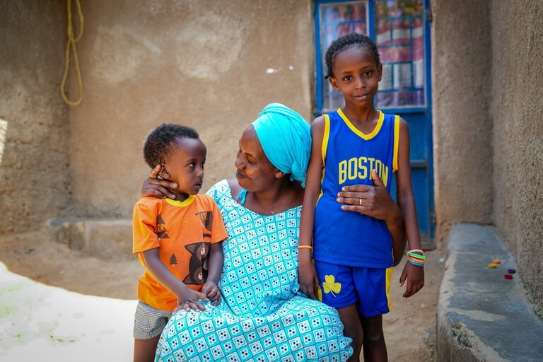
Uganda — Refugee family portrait. Teal/earth palette.
9/10
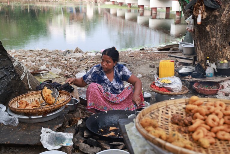
Myanmar — Food vendor. Livelihood photography.
8.5/10
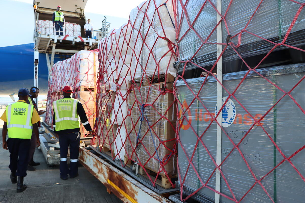
Mozambique — Airstrip operations. Logistics-focused.
7/10
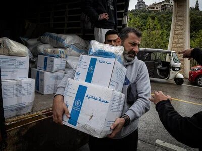
Lebanon — WFP-branded boxes. Distribution context.
7.5/10
What's Working
- ✓ Humanist and dignified — no exploitation photography
- ✓ Global geographic breadth — 120+ country contexts
- ✓ Rich environmental storytelling (the Myanmar image is benchmark quality)
- ✓ WFP branding visible on field assets (boxes, vehicles, vests)
What's Missing
- ✗ No art-directed campaign photography with deliberate composition
- ✗ Homepage hero leads with logistics (truck) — minimal emotional pull
- ✗ No lifestyle photography connecting mission to donor daily life
- ✗ No unified color palette across photography output
04 — Campaigns & Creative Work
High Highs. Long Gaps. No Current Lead Agency.
WFP's best campaigns are genuinely excellent — but they're years apart and no external creative partner has been
named since 2019. Internal teams carry the load between peaks.
2021 — Instagram Campaign
Empty Feed
690M
Celebrities and influencers shared blank Instagram posts during Ramadan with #EmptyFeed — symbolizing the daily reality of hunger. Internally originated by WFP MENA comms team. Viral across MENA. No external agency.
This is the template: culture-led, platform-native, no big budget needed.
Internal — Abeer Etefa, WFP MENA
2018–2019 — Global Cinema
Feed Our Future
Heartbreaking cinema advertising highlighting potential lost to child hunger. Conceived by Sir John Hegarty (The Garage Soho) and directed by Somesuch. WFP's most artistically ambitious campaign. Global cinema distribution.
The Garage Soho (Sir John Hegarty)
2015–Present — Mobile App
ShareTheMeal
Micro-donation app. 314M+ meals shared by 2M+ supporters. Selected as "Best App" by Apple and Google 2020. Nobel Prize doubled sign-ups. But visual identity is 8+ years old.
AJ&Smart · 400 Communications
2025 — WFP USA National Campaign
Fill the Silence
Custom portraits of 8 hunger-affected individuals by artists Brandon Breaux + Indie184. PSA set to The Weeknd's "Give Me Mercy." Shifts from crisis to empowerment framing.
The Cre8tors · WFP USA
Agency Timeline
2015–2016
AJ&Smart
ShareTheMeal UX
2017
RE-UP Amsterdam
Digital influence
2018–2019
The Garage Soho
"Feed Our Future"
2019→2026
⚠ No named agency
Internal teams carry creative
2026+
CE Opportunity
Field is open
05 — Digital Experience
wfp.org: Solid 2019. donate.wfp.org: Broken 2024.
Three distinct digital worlds: the global institutional site (competent but dated), the donation flow
(critically underperforming), and WFP USA (meaningfully better). The single highest-value page in the
WFP ecosystem is a 4/10.
wfp.org
6
Competent but 5+ years behind peers. 2018–2019 aesthetic. No motion. Overloaded homepage.
donate.wfp.org
4
Cookie modal blocks CTA. Truck hero. Zero social proof. Below-fold form. Critical failure.
wfpusa.org
7
Red CTA, stencil font, human hero photo, no cookie wall. 3+ years more modern than .org.
Website Critical Issues — Priority Stack
- Cookie consent modal blocks donation page hero. This is conversion sabotage. Remove or replace with bottom banner immediately.
- Donation page hero shows a truck, not a person. Replace with human-centered photography. One change, measurable uplift.
- No Nobel Peace Prize badge on donate or homepage hero. The single most powerful trust signal in global civil society is invisible in their donor funnel.
- Homepage tries to serve every audience simultaneously. Information overload, no personalization, no audience segmentation pathways.
- Carousel hero. A known low-engagement UX anti-pattern used by organizations that haven't updated their thinking since 2012.
06 — Social Media
76K YouTube Subscribers. A Nobel Peace Prize Laureate.
The numbers don't add up. An organization that fed 124M people and won the Nobel Prize has 76,000 YouTube subscribers.
That's a communications failure, not an audience problem.
| Platform |
Audience |
Content Strategy |
Performance |
CE Gap |
| Instagram @wfp |
~8M+ followers |
Field photos, infographics, Reels, celeb ambassador content |
Mixed |
No unified visual language; inconsistent production quality |
| TikTok @worldfoodprogramme |
Growing |
WFP USA-led paid campaigns; Gen Z/Millennial targeting; 70% ROAS increase 2024 |
Strong (paid) |
Organic content strategy underdeveloped vs. paid performance |
| YouTube @WFP |
76.2K subscribers |
Crisis reports, ambassador features, supply chain docs, innovation |
Critical underperform |
76K subs for Nobel laureate = severe under-monetization of content library |
| X/Twitter @WFP |
Active |
Operational news, crisis updates, political advocacy |
Mixed |
Platform in decline; no clear pivot strategy |
| LinkedIn |
Large (institutional) |
Operational updates, policy, B2G donor relations, partnerships |
Appropriate |
Minimal CE angle — this is institutional comms territory |
The 76K Problem
WFP's YouTube channel has 76,200 subscribers and 1,000+ videos. For comparison: a mid-tier cooking influencer
has more reach. The content exists — WFP produces field documentaries, ambassador interviews, crisis updates,
and innovation content. The problem is no channel brand strategy, no consistent packaging, no SEO-optimized titles,
no algorithm-aware publishing cadence. This is 1,000 videos waiting for a content system to unlock their value.
07 — Campaign Tone
Humanitarian Urgency vs Modern Brand Energy.
WFP operates between two poles. Most output sits at Pole 1. The moments of Pole 2 energy are exceptional
but isolated. The gap between the poles is where CE operates.
Pole 1 — Current Default
Humanitarian Urgency
- "318M people facing acute hunger"
- Hard numbers, famine reporting
- Documentary-style field photography
- UN institutional weight and language
- Crisis communications cadence
- Government donor accountability
↔
CE works here — bridging the gap
Pole 2 — Emerging / Aspirational
Modern Brand Energy
- ShareTheMeal — gamified micro-donations
- Celebrity ambassador network (The Weeknd)
- TikTok fundraising — Gen Z conversion
- "Fill the Silence" — empowerment portraits
- "Empty Feed" — culture-led social mechanics
- Nobel Prize as brand identity cornerstone
The USAID funding crisis (2025) makes Pole 2 work more urgent than ever. With government funding at risk,
WFP needs to build a private donor base from scratch at scale. That requires consumer brand energy, not
institutional communications. The donors who will fill the gap are 25–44, digital-native, and respond to
empowerment narratives — not guilt-and-despair.
08 — Communications Gaps
Seven Gaps. One Open Field.
These are structural gaps in WFP's brand communications — not temporary issues. They've accumulated over
years without a named lead creative partner.
01
No Lead Creative Agency (2019–present)
The most significant gap. WFP hasn't had an external creative agency lead since The Garage Soho's
"Feed Our Future" (2019). Internal teams carry all creative. No external challenger voice. No award-circuit ambition.
Critical
02
Donation Flow is Broken
donate.wfp.org is a 4/10. Cookie modal conversion-kill. Truck imagery. Zero social proof.
No Nobel Prize badge. For an org that received 54% of funding target, every conversion point matters.
Critical
03
Website 5+ Years Behind Peers
UNICEF, UNHCR, charity:water have moved to editorial, motion-rich, story-driven experiences.
WFP.org looks 2018–2019. Homepage overloaded; serves all audiences poorly.
High Priority
04
Social Media Underperforms Its Scale
76K YouTube subscribers for a Nobel laureate that assists 124M people is extraordinary
underperformance. Instagram engagement inconsistent. No unified content system across channels.
High Priority
05
Brand Split: Global vs. USA
wfp.org (UN Blue, institutional) and wfpusa.org (red, stencil, emotional) feel like different orgs.
No coherent brand architecture explaining the relationship. Donor dissonance.
Ongoing
06
Nobel Prize Completely Underlevered
WFP won the Nobel Peace Prize in 2020. 5 years later, it barely appears in their donor
funnel or homepage hero. One of the most powerful trust signals in civil society — invisible.
Ongoing
09 — Competitive Context
WFP vs The Humanitarian Sector.
| Organization |
Digital Quality |
Social |
Design |
Notable Strength |
Overall |
| charity:water |
9.5/10 |
Excellent |
Best-in-class |
Donor-obsessed; entire org treats brand as infrastructure |
|
| UNICEF |
8/10 |
Strong |
Magazine-style editorial |
Consistent visual system; strong digital storytelling |
|
| UNHCR |
8/10 |
Growing |
Bold type, immersive |
Strong visual identity evolution; modern redesign |
|
| MSF (Médecins SF) |
7.5/10 |
Strong |
Clean, high-contrast |
Brand integrity; consistent field-authentic tone |
|
| WFP ← Current |
6/10 |
Mixed |
Institutional, dated |
Nobel Prize, field photography, ShareTheMeal mechanic |
|
| Red Cross |
6.5/10 |
Moderate |
Corporate but consistent |
Strong brand recognition; emergency credential |
|
WFP is a 6/10 in a category where charity:water has proven that 9.5/10 is achievable for a humanitarian org.
The gap is not about budget or mandate — it's about treating communications as a core organizational capability.
10 — CE Opportunity Zones
Where Curious Endeavor Lands.
Five specific capability zones where CE's strengths map directly to WFP's documented gaps.
01
Social Content Systems
WFP's social underperformance is a content architecture problem. CE builds scalable visual systems — templates, tone frameworks, content formats — that internal teams can operate without constant agency reliance. Instagram, TikTok, YouTube Shorts.
Highest Volume Value
02
Donation Flow Redesign
donate.wfp.org is a 4/10. CE builds high-converting landing pages. Fix the cookie modal, add human hero photography, integrate Nobel Prize trust badge, add social proof. One engagement — measurable fundraising uplift.
Highest ROI Single Action
03
Modern Donor Brand Voice
WFP needs copy that bridges urgency and empowerment for 25–44 year-old donors. Campaign concepts, landing page copy, email sequences, and narrative frameworks that work across the brand family without losing institutional credibility.
Strategic Positioning
04
Signature Campaign Concept
No named creative partner since 2019. The field is open. CE proposes 1–2 campaign directions: one building on the "Empty Feed" culture-led social mechanic model, one on the "Fill the Silence" empowerment portrait model.
Highest Prestige Value
05
Annual Report & Publications
400 Communications handles this currently. CE can produce more editorially ambitious, digital-first annual review content. The 2024 funding crisis story needs to be told with the craft it deserves.
Recurring Relationship
CE
The CE Pitch Thesis
"WFP is the most impactful organization on Earth — and your communications don't yet tell that story at the level it deserves. You need a partner who understands both humanitarian complexity and modern brand systems. We're ready."
→ Contact Communications Leadership
Strategic Summary — 7 Key Findings
WFP has world-class operational scale, a Nobel Peace Prize, and a genuine audience acquisition crisis —
but a brand communications infrastructure that's running 5 years behind its peers and
no external creative partner since 2019.
01
No named creative agency since 2019 — the lead creative role is genuinely open
02
Donation flow rated 4/10 — cookie modal alone is a conversion-killing design failure
03
USAID crisis forces WFP to build private donor base — brand urgency is now existential
04
76K YouTube subs = severe underperformance of a 1,000+ video content library
05
Nobel Peace Prize 2020 is virtually invisible in donor comms — biggest unused trust signal in civil society
06
WFP.org vs WFP USA = two separate brands — no unified creative direction
07
"Empty Feed" 2021 proves WFP can produce insight-led, culturally resonant social campaigns — with or without big agency budget
06 — Social Media
76K YouTube Subscribers. A Nobel Peace Prize Laureate.
The numbers don't add up. An organization that fed 124M people and won the Nobel Prize has 76,000 YouTube subscribers. That's a communications failure, not an audience problem.
The 76K Problem
WFP's YouTube channel has 76,200 subscribers and 1,000+ videos. For comparison: a mid-tier cooking influencer has more reach. The content exists — WFP produces field documentaries, ambassador interviews, crisis updates, and innovation content. The problem is no channel brand strategy, no consistent packaging, no SEO-optimized titles, no algorithm-aware publishing cadence. This is 1,000 videos waiting for a content system to unlock their value.