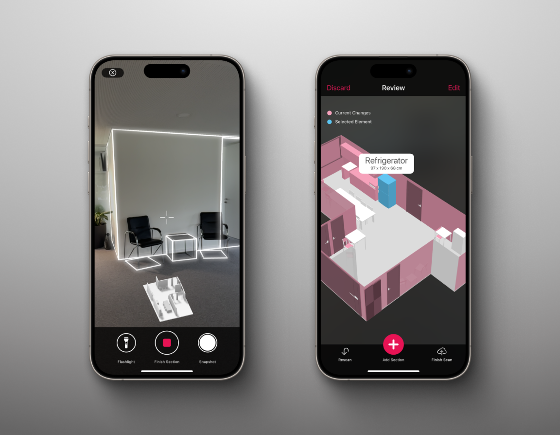
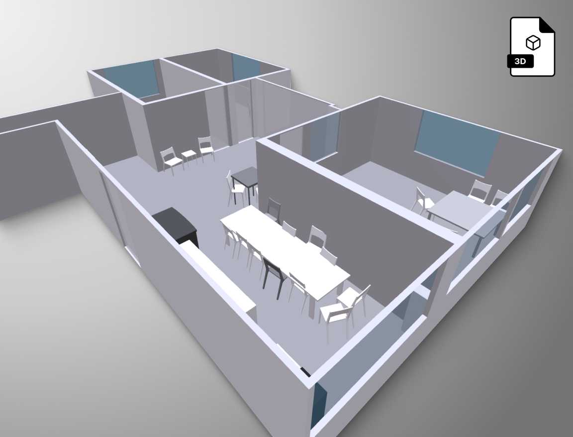
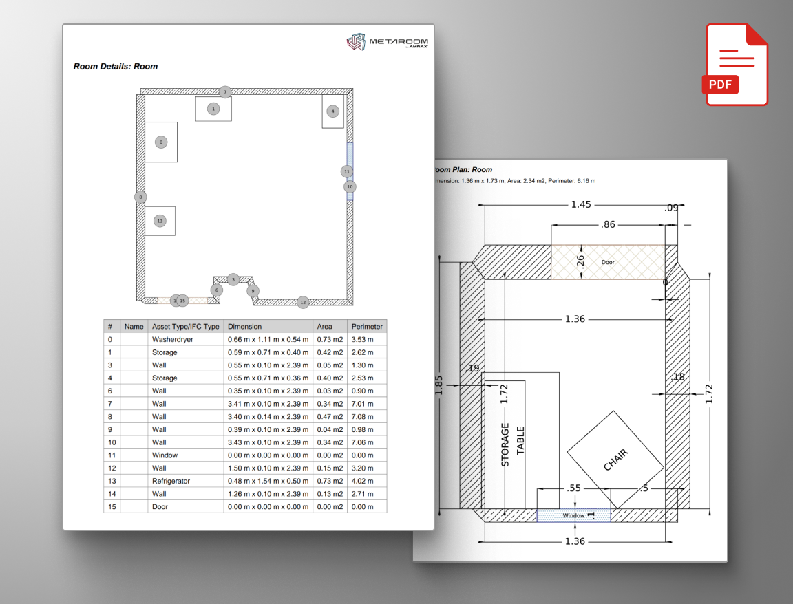
We looked at the spatial digitization category — Matterport, NavVis, and the broader AEC tech market. Metaroom has a genuinely differentiated product: iPhone LiDAR scanning with professional CAD/BIM output, at a fraction of the cost and hardware overhead of the competition. The iF Design Award, the Siemens Xcelerator partnership, the Autodesk authorization — these are substantial signals that deserve a brand to match.
“Metaroom by AMRAX®” is a compound identity that creates friction at every touchpoint where brevity matters — press mentions, app store listings, partner directories, conference badges, social bios. The typography is Montserrat and Inter, the most generic free Google Fonts pairing in European SaaS. The website runs on Elementor. There is no standalone logomark — in a mobile-first, app-first product, that is a functional gap that shows up everywhere a compact icon is needed.
The gap between what the product is and how the brand presents it is the opportunity. Below is how CE would close it.
“Metaroom by AMRAX®” is one of the longest brand names in its category. Matterport is one word. NavVis is one word. Every time “Metaroom by AMRAX” appears in a press headline, a partner listing, or a conference badge, the compound creates noise where there should be signal. CE begins by resolving the architecture — which name leads, what role the other plays, and how the brand communicates as a single coherent identity across every context.
Metaroom has a distinctive brand color — the magenta-red is strong and memorable. What it lacks is the system around that color: a standalone logomark that works as an app icon and social avatar, a display typeface that carries the precision the product represents, and a secondary color logic that gives the orphaned green a role. CE builds the identity system from the ground up — built to scale across app, web, and every professional context where the brand appears.
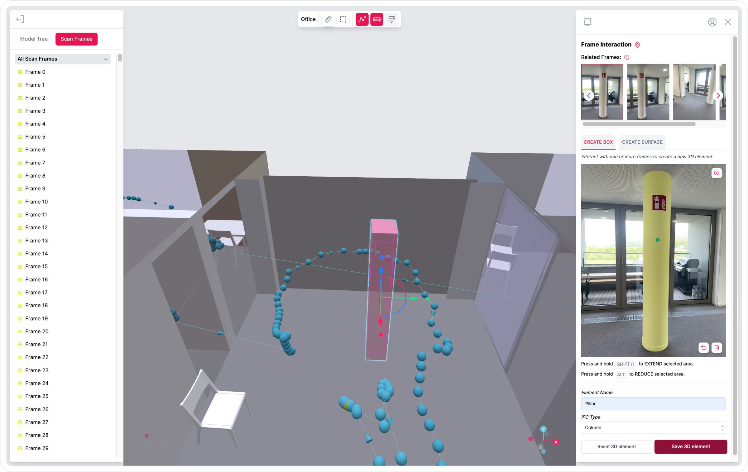
The current site communicates capability through content — the feature lists, the export format counts, the comparison tables are all there. What is not there is design authority. A product with a Siemens Xcelerator partnership and an iF Award should not present itself on a WordPress page builder template. CE builds a website that earns the same credibility as the product: custom-built, industry-specific, with the iF Award and partner credentials given the presence they have earned.
We share our research and point of view. You share where the brand sits today and where you want it to go. No slides to sit through — a direct conversation between the people who will do the work.
If the call is productive, CE delivers a full brand audit — current state, the naming and architecture recommendation, and a clear strategic direction. This is the foundation for all visual and digital work that follows. You decide whether to proceed after seeing it.
Visual identity system, new website, app store assets, social visual language. CE operates as Metaroom’s brand partner through the build and beyond — consistent output at the brand’s standard, without the overhead of a full in-house team.
Every engagement starts with the introductory call. No commitments beyond that until you have seen the work and decided it is the right direction.
Lukas Richthammer — Vienna — Curious Endeavor