Brand Research — April 2026

Metaroom by AMRAX

An iF Design Award-winning spatial digitization platform that turns an iPhone into a professional LiDAR scanner — competing with Matterport at a fraction of the cost. The product is sophisticated. The brand expression is not.

Founded in Salzburg in 2020, Metaroom by AMRAX has built a genuine technical moat: real-time SLAM-based scanning, 30+ professional export formats, and deep integrations with Siemens, Autodesk, RELUX, and Ranplan. The product serves 9 distinct professional verticals. The brand serves one aesthetic: dark-SaaS standard.

Founded
2020
HQ
Salzburg, Austria
Team
~24
Formats
30+
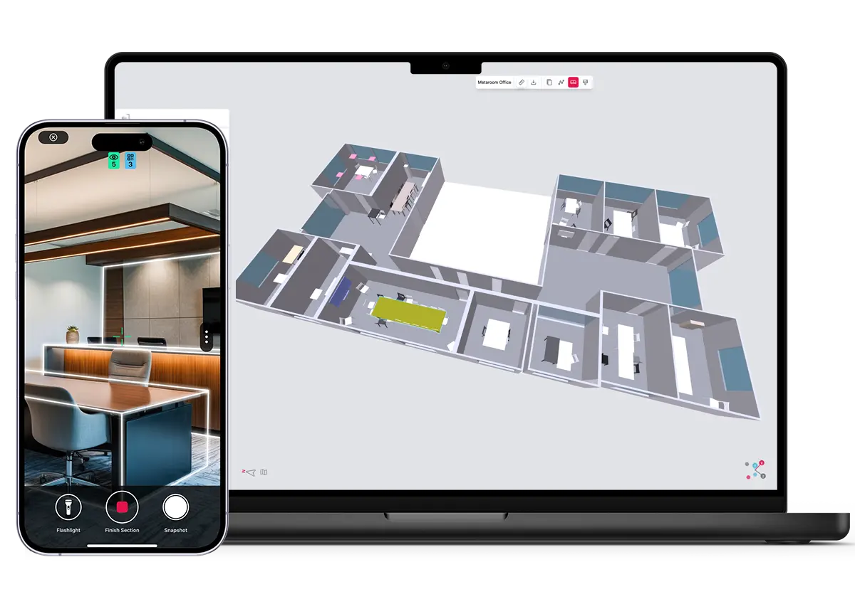
Metaroom homepage hero
Landing feature Product UI

Founded Salzburg, 2020. B2B SaaS / Spatial Digitization. Partners: Siemens Xcelerator, Autodesk. Awards: iF Design Award 2024. Rated 4.7/5 across Capterra, GetApp, Software Advice.

Metaroom positions as the professional LiDAR scanning platform for iPhone — “Accurate 2D Floor Plans & 3D Models from Your iPhone.” The core competitive frame is direct and confident: no specialist hardware, professional output, a fraction of Matterport’s cost.

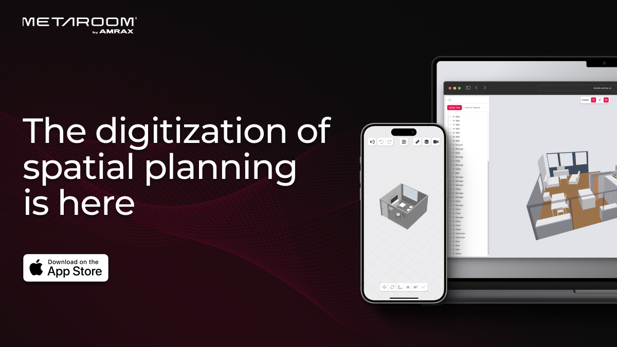
The digitization of spatial planning is here
  • No dedicated hardware — iPhone Pro / iPad Pro LiDAR only
  • 30+ professional export formats — IFC, DXF, GLB, IES, RELUX, DDScad
  • 9 industry verticals — broadest coverage in the category
  • Speed — scan in minutes, not hours
  • Price accessibility — from €9/month vs. €3,180+ Matterport hardware
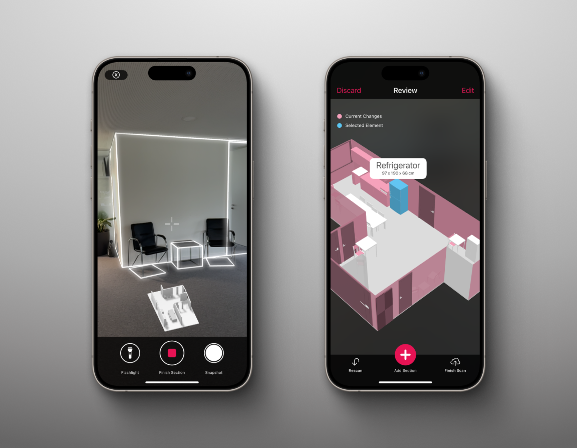
App scanning in use

The brand operates under two simultaneous identities: ‘AMRAX’ (the legal/technology entity) and ‘Metaroom by AMRAX®’ (the product brand). The registered trademark on ‘Metaroom’ suggests formal brand investment — but the compound name creates friction in every context where brevity matters: press mentions, app store listings, social bios, partner directory entries, conference badges.

#E71354
Metaroom Pink / Primary
#0B0B0B
Near-Black / Background
#1A1A1A
Charcoal / Section background
#61CE70
Green / Success states only
#F8F8F8
Off-White / Light sections
#FFFFFF
White

The palette is a tight, high-contrast system — near-black dominates, #E71354 punches as the single accent. Green (#61CE70) appears only for checkmarks and success states — functionally used but visually disconnected from the pink primary. The pink tints (#FFE0E9 through #FF97B7) appear in gradients and hover glows but are not part of the named brand palette. An opportunity to develop a more intentional secondary color system.

Display — Montserrat 700
Digitize your space.
Geometric, modern European. Clean but generic — used by thousands of European SaaS startups.
Body — Inter 400
Scan any room with your iPhone Pro. Generate accurate 2D floor plans and 3D models in minutes. Export to IFC, DXF, GLB, and 30+ professional formats.
Near-universal B2B SaaS body font. Reliable, neutral, legible.
CE Note
Both fonts are free Google Fonts. The pairing is competent but carries no brand signal. For a company with an iF Design Award — one of the world’s most prestigious product design recognitions — the typography does not match the product’s design ambition.

Website

  • Dark-first aesthetic with pink radial gradient halos
  • Frosted glass card effect throughout
  • Elementor/WordPress CMS — template scaffolding visible on inspection
  • Navigation: logo left, links center, CTA right — standard SaaS
  • Rounded corners 8–28px range
  • Hover: cards elevate + pink border glow

App

  • Mobile-first iPhone/iPad frame showcases
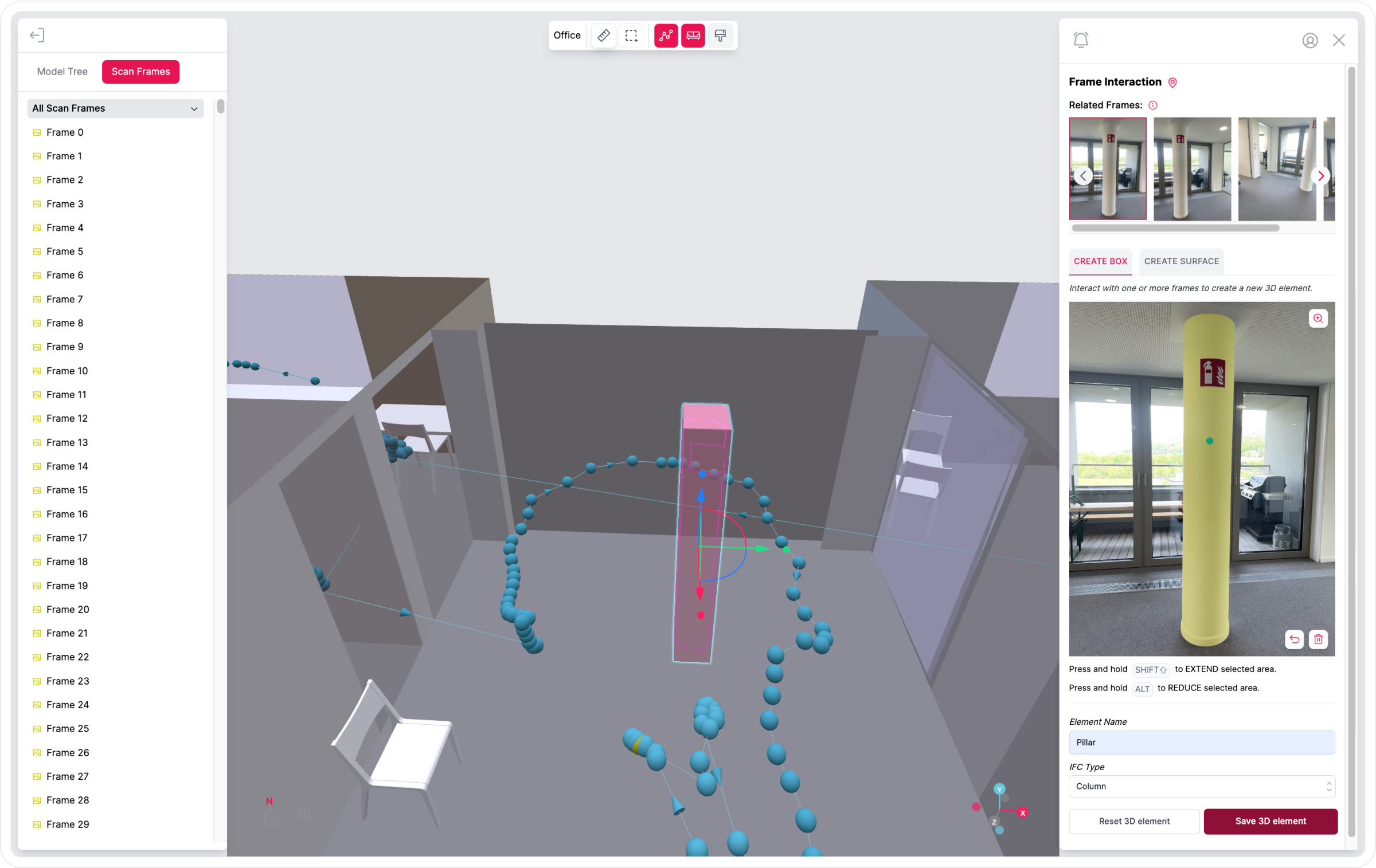
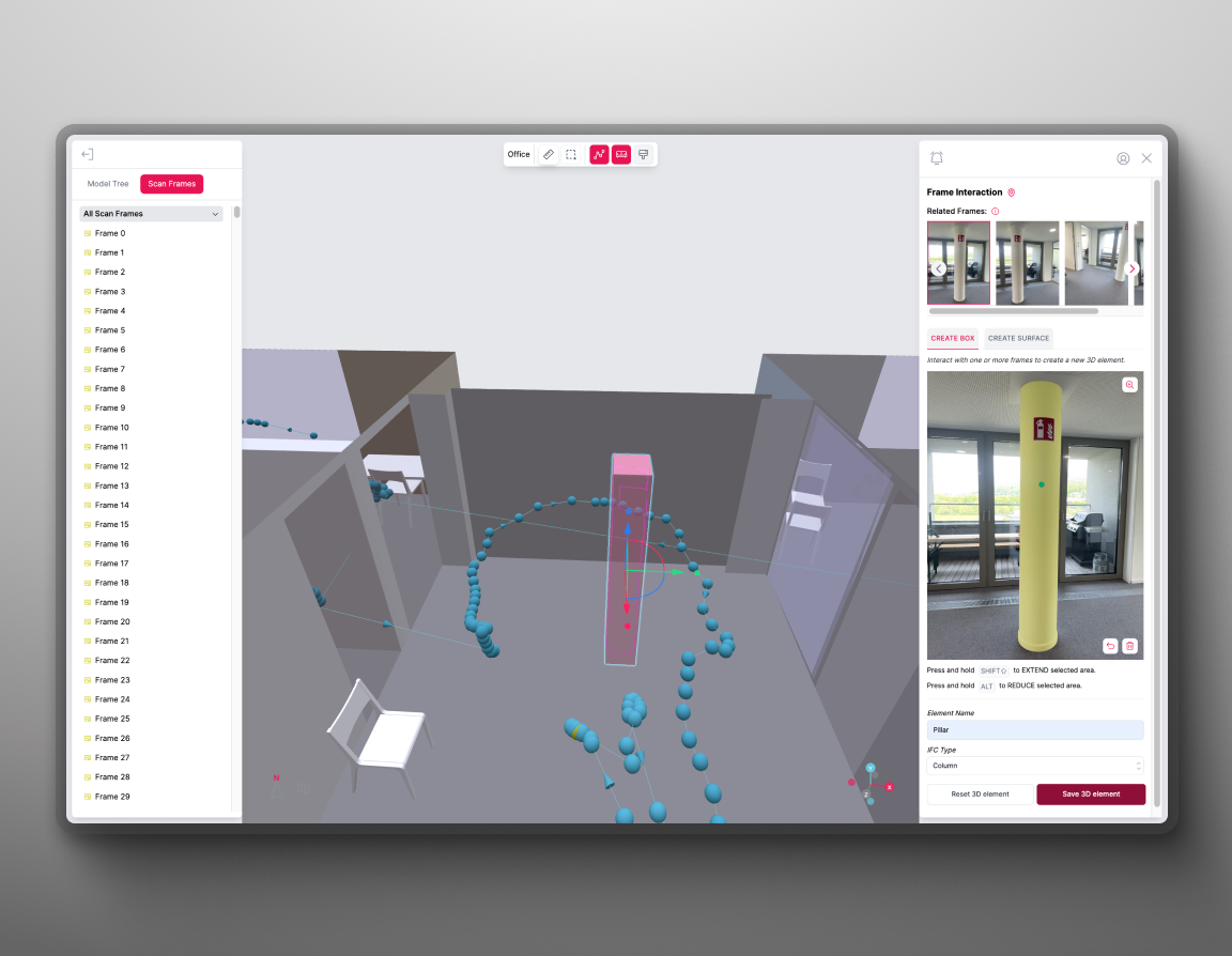
  • Product screenshots as primary visual evidence
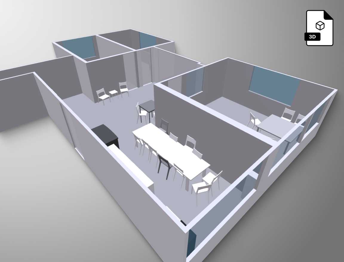
  • 3D wireframe and point-cloud renders
  • Real-world building context shots
  • No original photography aesthetic or signature visual style
App interaction screen 3D model output

Strengths

  • iF Design Award 2024 — internationally recognized product design credential
  • #E71354 pink is distinctive — high contrast, memorable, not a common SaaS primary
  • Dark-first aesthetic is modern and consistent across site and app
  • Product naming is clear — “Metaroom,” “Scan,” “Workspace” are immediately legible
  • Frosted glass card system creates visual cohesion across the product UI
  • Siemens + Autodesk logos as trust signals are well-placed

Weaknesses

  • No standalone logomark — the brand has no compact icon form for app icon, favicon, social avatar
  • “Metaroom by AMRAX®” is verbally cumbersome — one of the longest brand names in the category
  • Montserrat + Inter is the most generic SaaS font pairing in Central Europe
  • Elementor/WordPress site — template scaffolding undermines the premium product positioning
  • Green accent (#61CE70) is orphaned — no relationship to the pink primary in the brand system
  • No founder narrative or human story surfaced through the brand
  • Social content is all demos and screenshots — no visual content system, no brand photography
CE Assessment — HIGH

An iF Design Award-winning product running on a WordPress page builder. The gap between product and brand is the opportunity.

Matterport has the market position and the hardware. NavVis has the enterprise scale. Metaroom has the price-to-capability ratio, the professional output depth, and the design award — but presents with a brand system that doesn’t reflect any of it.

The dual-brand architecture (AMRAX / Metaroom by AMRAX) is the most pressing brand problem. It creates noise in every context. The naming, the identity system, the typography, and the website are all working below the level of the product they represent.

Archetype
Expert + Pioneer
  • Action-oriented short sentences (“Scan. Create. Export.”)
  • Benefit-first, jargon-second
  • European precision — measured, not overselling
  • Addresses professionals as peers
“The brand reads like a very capable engineer who hasn’t hired a writer yet. The product knows exactly what it does. The brand hasn’t found the words that make someone else feel it.”
Brand dimension Metaroom Matterport NavVis
Visual identity Pink-on-black, distinctive color. No standalone mark. Mature, clean, recognizable. Wordmark + icon. Enterprise-grade, systematic.
Website Elementor/WordPress — capable but template-built. Custom, fully designed. Enterprise custom.
Brand name “Metaroom by AMRAX®” — compound, verbose. Single clean word. Single clean word.
Typography Montserrat + Inter — free Google Fonts, generic. Custom/distinctive. Professional, systematic.
Awards / credentials iF Design Award 2024 — strongest design credential in category. Revenue-based credibility. Enterprise client logos.
Social content Demos + screenshots, no visual system. Produced campaigns. Enterprise case studies.
Brand maturity Product-led. Brand expression lags product depth. Brand-invested, mature. Enterprise-standard.

Primary: LinkedIn (two pages — Metaroom showcase: ~2,900 followers, AMRAX parent: ~324). Instagram: @metaroom_by_amrax (~3,280 followers, 237 posts).

The dual LinkedIn presence (showcase page + parent company page) dilutes follower concentration and creates brand confusion. The Instagram presence is active but relies entirely on screen recordings and product screenshots. No visual design system, no brand photography, no motion identity.

Primary professionals
  • Architects and interior designers
  • BIM managers (IFC workflow)
  • Facility managers
  • Wireless/network planners
  • Lighting designers (RELUX/DIALux)
Secondary verticals
  • Real estate professionals
  • Energy consultants
  • Carpentry & woodworking trades
  • Insurance assessors
9 professional verticals served — a breadth that is a product strength and a brand communication challenge. The brand currently speaks in product terms (scan, export, digitize) rather than in the language of any specific profession.
Ready to see the pitch?
→ View the CE proposal