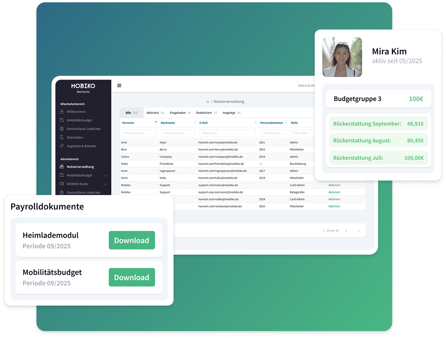
MOBIKO has built the most complete product in German corporate mobility — three pillars in one app, deep tax expertise, ISO 27001, and an 80% employee adoption rate that most B2B platforms never reach. The product story is strong. Giving it a voice is the work.
Founded as a spin-off from Audi Business Innovation and Mantro in 2017, MOBIKO has built a proprietary tax-optimization algorithm, a three-product platform (Deutschlandticket, Mobility Budget, Home EV Charging), and now a B2B MaaS division — all with a team of ~24. What's distinctive is how far the product has outpaced the brand expression: their positioning is clear, their results are measurable, and their advisory model is genuinely differentiated — none of which is visible at first glance.
Founded Munich, 2017. HR Tech / Mobility SaaS. Customers include Volksbank Raiffeisenbank Dachau eG, Arthur D. Little, Star Finanz, Digital Charging Solutions. ISO 27001 TÜV certified.
Mobiko positions as 'Der Anbieter für Mitarbeitermobilität' — the all-in-one provider for employee mobility. The three-pillar product (Deutschlandticket, Mobility Budget, Home EV Charging) is positioned as a complete solution rather than a point product, backed by proprietary tax optimization and deep advisory expertise.
Core differentiators:
No major rebrand detected. MOBIKO has grown product-first, with brand expression following functionality. The teal-forward palette and Source Sans Pro typography have been consistent. The brand reflects a B2B SaaS company that built for enterprise adoption, not consumer attention.
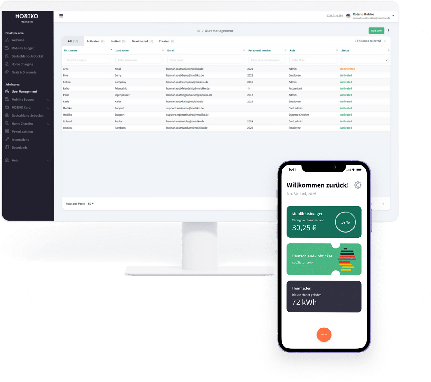
Green signals sustainability and availability. Teal anchors authority and trust. Orange (coral) drives action — primarily in the app's floating action button and CTA layer. The palette is coherent but underutilized in brand communications outside the product UI.
Primary headline face. Bold, clear, no-nonsense German SaaS.
Wir unterstützen Unternehmen dabei, ihren Mitarbeitern eine steueroptimierte Mobilität anzubieten — einfach, digital, compliant.
Numbers are king — the most prominent typographic element in the app is always the monetary value.
Source Sans Pro is functional and readable but generic for a brand claiming advisory depth. An upgrade to a more distinctive face — while preserving legibility for the app's number-heavy UI — is one lever in the brand system build.
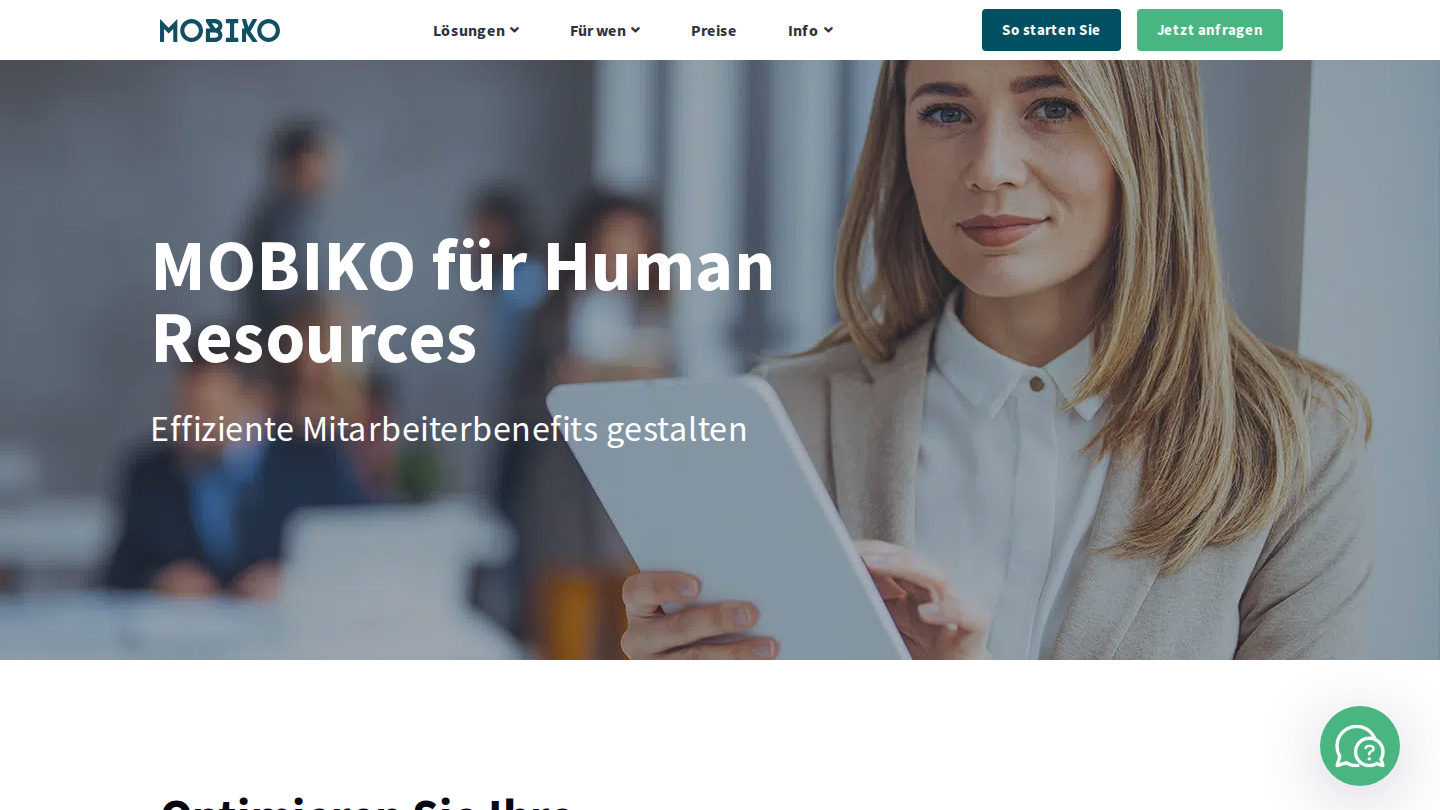
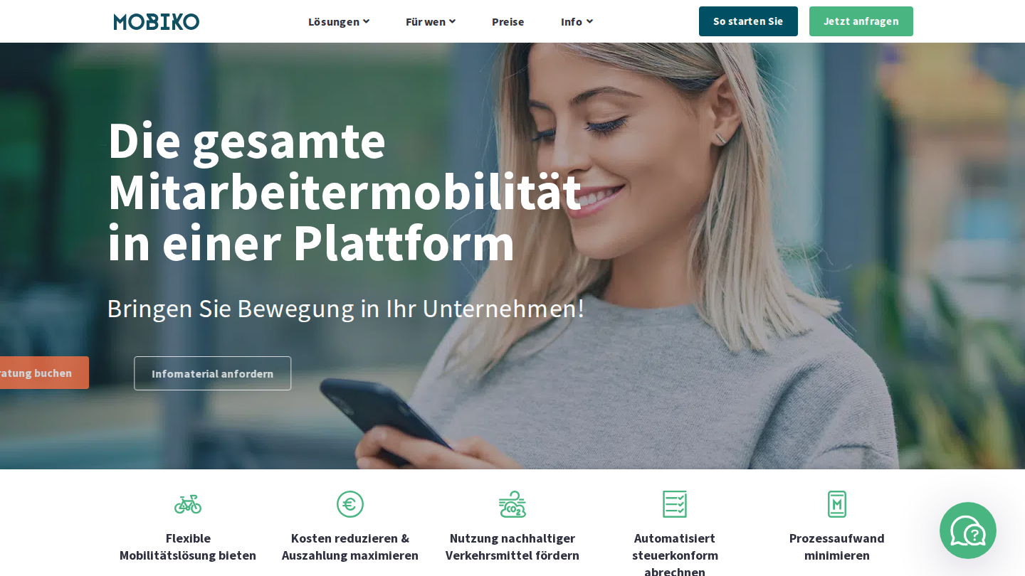
Website
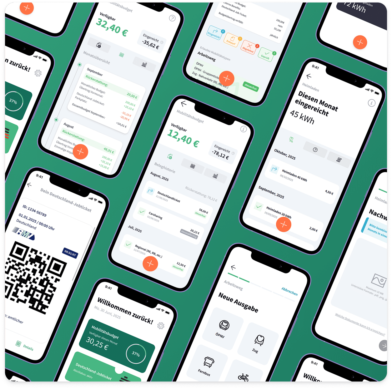
App
Energy: Calm confidence. The brand knows more about German mobility law than its competitors and lets that show without being arrogant about it.
| Brand dimension | MOBIKO | Navit | Rydes |
|---|---|---|---|
| Visual identity | Teal-forward, consistent palette. No distinctive mark or system beyond color. | Clean, modern. More polished web presence. | Sharp, VC-finish. Clear visual voice. |
| Website | WordPress/Elementor — functional, no visual differentiation | Custom, well-structured | Lean, brand-forward |
| Brand voice | Advisory, precise — but inconsistently applied | Modern SaaS, confident | Purpose-led, sustainability angle |
| Social presence | LinkedIn active, no visual system. Instagram minimal. | Active, consistent visual style | Focused, on-brand |
| Content assets | Mobilitätsreport — most data-rich in category. Underactivated. | Blog + case studies | Sustainability reports |
| Brand maturity | Product-led. Brand expression lags product depth. | Brand-invested | Brand-invested |
Primary channel: LinkedIn (2–3x/week cadence). Instagram presence is low-to-none. The current posting approach is data-heavy but lacks a consistent visual language or cadence anchored to the brand.
Existing content pillars:
Posts are predominantly text and link-based. No identified visual content system. The expertise and data exist — the design language to carry them does not.
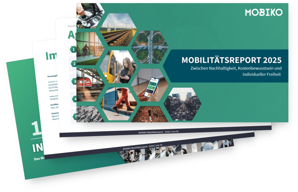
MOBIKO's annual mobility report covers 260K+ receipts and €13.5M in mobility volume across their client base. This is the category's most data-rich annual publication — and currently functions as a lead generation PDF rather than a brand event.