16 projects across Vienna, London, New York, Copenhagen, Chicago, and Amsterdam. Office conversions, heritage repositioning, large-scale rental branding. The patterns that separate forgettable buildings from iconic ones.
16 Projekte in Wien, London, New York, Kopenhagen, Chicago und Amsterdam zeigen, wie aus Büros Wohnungen werden – und aus Gebäuden, die lange nur funktioniert haben, Orte, an denen man leben will.
Es geht nicht nur darum, was ein Gebäude einmal war. Sondern darum, was man daraus macht.
These aren't theoretical frameworks. They're recurring decisions made by developers and brand teams who turned unremarkable buildings into destinations.
Keine Theorie. Sondern Dinge, die man immer wieder sieht – bei Projekten, die funktionieren. Entscheidungen, die aus ganz normalen Gebäuden etwas machen, das bleibt.
The original architect, the era, the building's former life — elevated into the core brand narrative. For Kaiquartier: Harry Glück designed this building AND Alt-Erlaa. That's not a footnote, it's the headline.
Wer ein Gebäude entworfen hat, aus welcher Zeit es stammt und was davor darin war – das ist kein Detail. Das ist der Anfang von allem. Für Kaiquartier heißt das: Harry Glück hat dieses Gebäude im selben Jahrzehnt wie Alt-Erlaa entworfen. Das ist keine Randnotiz. Das ist die Geschichte.
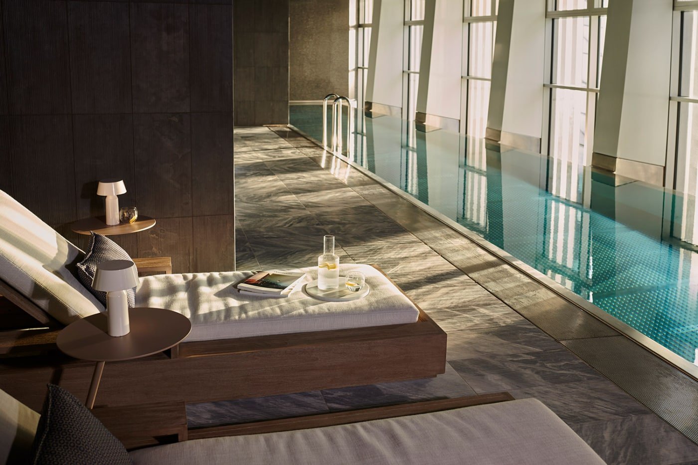
The before/after narrative is inherently compelling. “This was an insurance headquarters. Now it's 300 homes with a rooftop pool.” The transformation IS the marketing.
Aus einer Versicherungszentrale werden 300 Wohnungen mit Dachpool. Das muss man nicht erklären. Das ist die Story. Die besten Projekte machen genau das: Sie verstecken die Vergangenheit nicht. Sie bauen darauf auf.
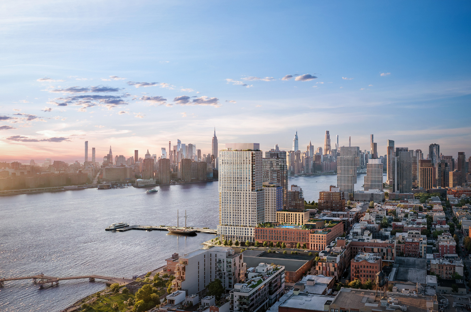
Projects near water weave it into naming, imagery, and brand language. Kaiquartier sits on Hietzinger Kai along the Wien River — an underused asset in the current positioning.
Wenn Wasser da ist, gehört es ins Zentrum. In den Namen. In die Bilder. In die Sprache. Kaiquartier liegt am Hietzinger Kai, mit dem Wienfluss direkt davor. Im Moment merkt man davon kaum etwas.
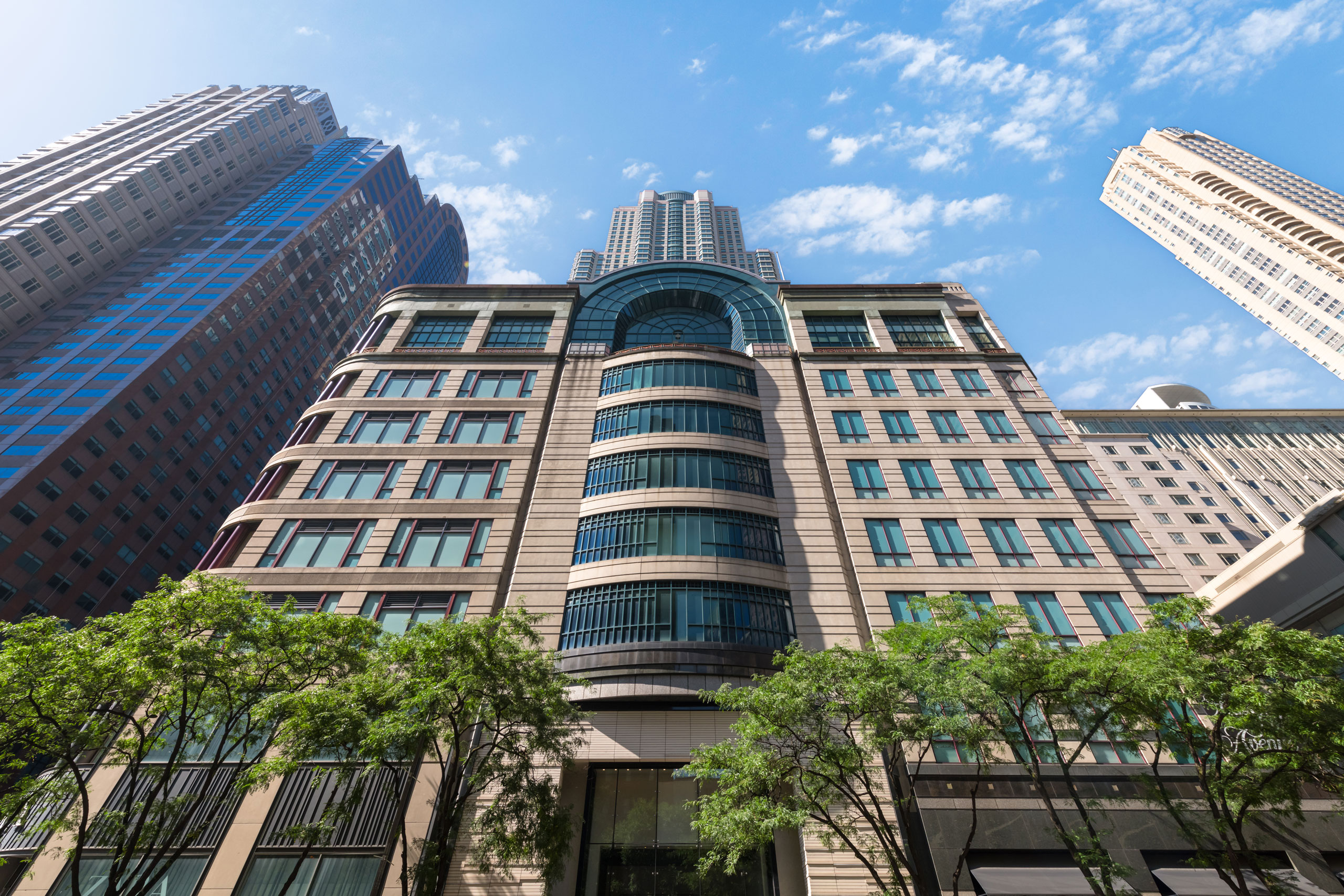
You don't sacrifice brand by being rental. The Huron and Front & York prove that rental buildings can carry the same aspirational identity as condos — if the branding commits.
Mieten ist kein Plan B. The Huron in Chicago zeigt, dass ein Mietprojekt genauso stark wirken kann wie Eigentum – wenn man es auch so erzählt. Es ist nicht das Produkt, das den Unterschied macht. Sondern die Haltung dahinter.
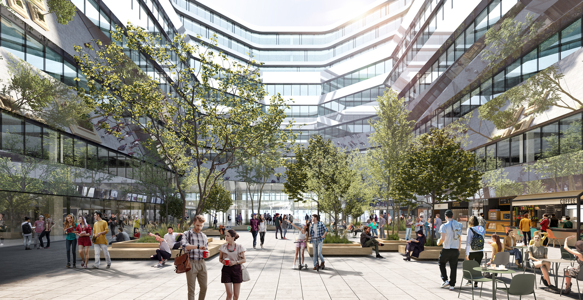
At 300+ units, a single identity risks feeling generic. Internal tiers or named collections create distinct identities within one project — standard, signature, penthouse.
300 Wohnungen sind nicht ein Produkt. Wer so groß denkt, muss Unterschiede machen. Wohnungen, die sich an verschiedene Menschen richten – ohne dass das Ganze auseinanderfällt.
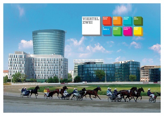
Reusing an existing structure is inherently sustainable. Vienna projects like Viertel Zwei and Biotope City show how to own this angle in the local market without it becoming greenwashing.
Ein Gebäude umzubauen, statt es abzureißen, ist bereits eine Entscheidung. Man muss sie nicht aufblasen. Wer das klar und ruhig kommuniziert, wirkt glaubwürdiger als jedes Zertifikat.
The strongest large-scale projects brand themselves as places, not buildings. A supermarket, pool, shared spaces — 300 apartments become a micro-district with its own culture.
Ab einer bestimmten Größe hört ein Haus auf, nur ein Haus zu sein. Mit Supermarkt, Pool und Gemeinschaftsräumen entsteht ein Ort. Etwas, das näher an einem Stück Stadt ist als an einem einzelnen Projekt.
Real-world conversions, heritage repositioning, and large-scale rental branding across Vienna, London, New York, Copenhagen, Chicago, and Amsterdam. Each one studied for what Kaiquartier can learn.
Büros, Silos, Kraftwerke, Postämter. Unterschiedliche Ausgangspunkte – aber ähnliche Ergebnisse.
Private residents' club, cinema, spa with pool/sauna/steam, gym, 24hr concierge, landscaped podium garden, valet parking
UHNW buyers, design-conscious collectors, international second-home buyers
THE most directly relevant reference. A 1960s office building rebranded as a design icon. Elevates original architecture rather than apologizing for it — the grid becomes a feature, not a bug. Position the era as “mid-century heritage,” not “dated.”
Nicht alles neu machen. Sondern das Bestehende so ernst nehmen, dass es wieder stark wird.
100,000 sqft amenity space, 75-ft pool (38th floor), private restaurant/bar, gym, co-working with podcast studios, canine club, Whole Foods, Life Time fitness
Global luxury buyers, HNWI
THE reference for office-to-residential conversion branding. Shows how to make building heritage (Art Deco / Harry Glück) a core brand asset rather than a liability.
Vergangenheit ist kein Problem. Sie wird erst dann zu einem Vorteil, wenn man sie zeigt.
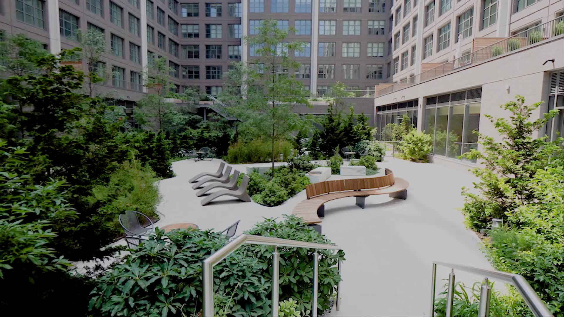
Courtyard gardens, curated ground-floor retail/cafés, co-working, fitness, shared terraces, community rooms. Near Tivoli + Central Station. Mixed rental/ownership.
Professionals and young families wanting central living with character — “premium accessible,” deliberately not ultra-luxury
Most relevant for scale (~500 vs ~300 units). Shows how to brand large-scale conversion as neighbourhood creation, not just a building. Heritage narrative (postal → living infrastructure) maps directly to office → home.
Größe verpflichtet. Wer groß baut, sollte auch so denken.
Rooftop pool with Lake Michigan views, fire pit terraces, gym, yoga/spin studios, golf simulator, coworking, private dining, dog run, children's play area
High-income renters-by-choice — professionals who CAN buy but prefer premium flexibility
Best example of luxury RENTAL branding. 382 units — nearly identical to Kaiquartier's 300. Proves you can build prestige around a rental product. Critical for the “freely financed rental” model.
Mieten ist kein Kompromiss – wenn man es nicht dazu macht.
Rooftop restaurant (public), double-height spaces (up to 7m ceilings), panoramic harbour views. Part of Nordhavn sustainable waterfront district.
Design-conscious affluent buyers, creative professionals wanting architectural statement living
A radical facade intervention completely redefined the building's identity. The glass facade modification at Kaiquartier could learn from this approach — the skin becomes the brand.
Manchmal braucht es einen klaren Schnitt, damit etwas wieder Bedeutung bekommt.
Brooklyn
Location-as-identity branding. Water/flow metaphors could translate to Wien River / Hietzinger Kai positioning.
Brooklyn
Internal product tiering (standard / signature / penthouse) within one building — relevant for 300 mixed apartment types.
Brooklyn
Mid-size building creating identity through material/texture storytelling rather than sheer amenity count.
London
Master-class in sub-brand architecture. Four distinct residential identities within one heritage master brand.
Amsterdam
Utilitarian building became community identity. The “third place” approach applies to Kaiquartier's supermarket + community spaces.
Vienna
Closest Austrian comparable. Sub-brand naming strategy shows how Vienna developers approach multi-building identities.
Vienna
Vienna projects can own nature/green positioning. Hietzing's parks could enable similar branding for Kaiquartier.
Vienna
Sustainability-first brand in Vienna. Reuse of existing structure = sustainable positioning without greenwashing.
Manhattan
“Timeless” positioning near a park/landmark. Hietzing + Schönbrunn proximity could enable a similar approach.
Brooklyn
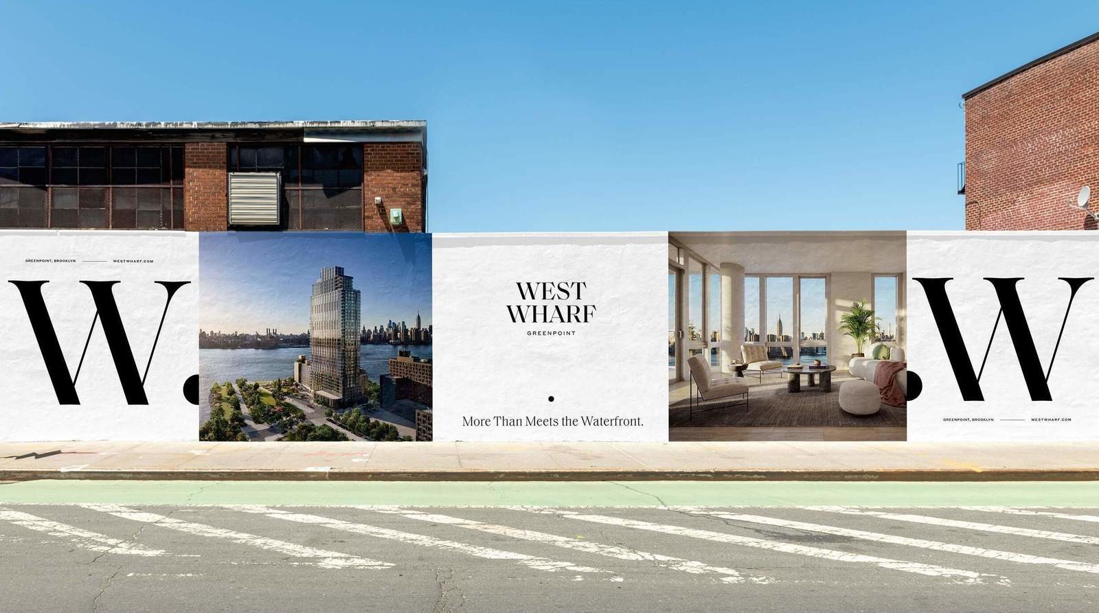
Stripped-back branding that lets location do the talking. A model for restraint when the address sells itself.
Brooklyn
Large-scale RENTAL with strong brand. Neighbourhood storytelling + community amenities prove it works at scale for renters.
16 lessons distilled from the strongest residential branding in the world. Each one directly applicable to Hietzinger Kai.
16 Erkenntnisse, die zeigen, wie aus den stärksten Projekten der Welt Entscheidungen für den Hietzinger Kai werden.
Harry Glück designed Alt-Erlaa — the most famous social housing in Europe — the same year he designed this building. That's not a footnote. That's the entire brand story.
Nicht die Adresse ist der stärkste Einstieg, sondern das, was das Gebäude einmal war.
“This was an insurance headquarters. Now it's 300 homes with a rooftop pool.” The before/after narrative is inherently compelling. Don't hide the past — make it the hook.
Der Unterschied zwischen früher und heute ist kein Problem. Er ist das, was interessant macht.
A building with a supermarket, pool, and shared spaces isn't just residential — it's a micro-district. Brand it as a place people belong to, not a product they rent.
300 Wohnungen sind kein Gebäude mehr. Es ist ein Ort.
The Huron proved that 382 rental units can carry the same aspirational identity as condos — if the branding commits fully. “Freely financed rental” is a feature, not a compromise.
Es geht nicht darum, was fehlt. Sondern darum, was da ist.
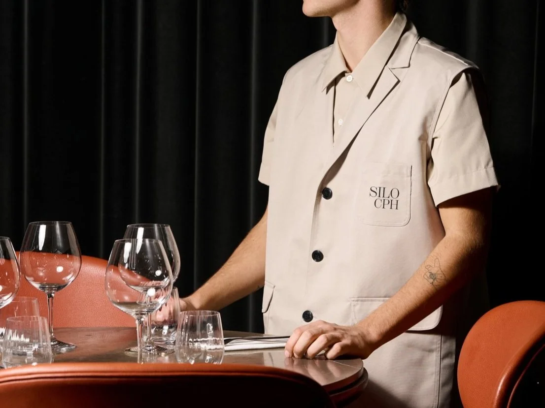
The Silo wrapped a 1963 grain tower in faceted glass and became a Copenhagen icon overnight. Kaiquartier's glass facade modification is the same opportunity — the skin becomes the brand.
Was man von außen sieht, prägt alles, was danach kommt.
Every waterfront project weaves the river into naming, imagery, and brand language. Kaiquartier sits on Hietzinger Kai along the Wien River — an asset the current positioning ignores entirely.
Wenn es da ist, gehört es ins Zentrum.
At 300+ units, a single identity risks feeling generic. Named collections — standard, signature, penthouse — let different audiences find themselves in the same building.
Nicht jede Wohnung muss gleich sein. Im Gegenteil.
You don't need a 40,000 sqft amenity deck to create identity. Texture, material, and craft can do what sheer scale cannot — especially at mid-size.
Material, Licht, Raumgefühl – nicht Quadratmeter.
Battersea runs four distinct residential identities under one master brand. Kaiquartier's 9 floors and 300 units have room for the same approach.
Unterschiede funktionieren, solange das Ganze klar bleibt.
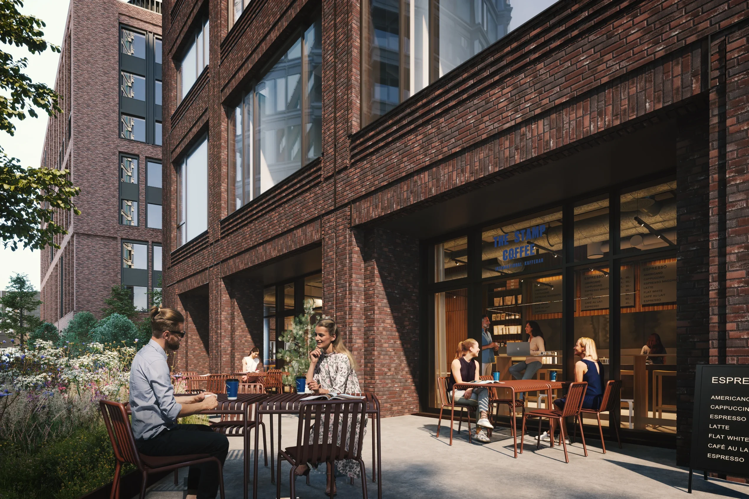
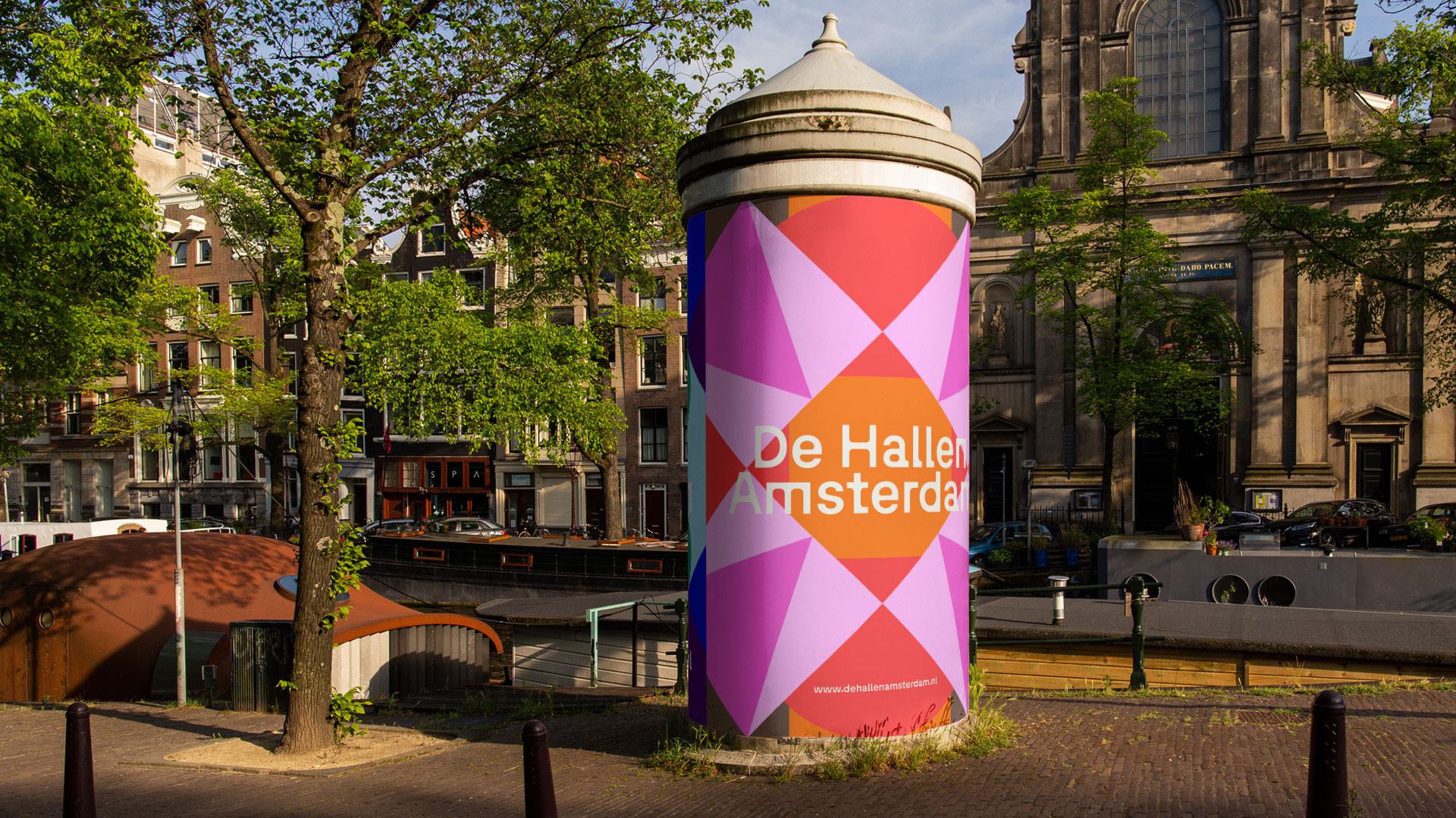
De Hallen turned everyday infrastructure — food hall, cinema, library — into the identity. Kaiquartier's on-site supermarket and community spaces are the same opportunity.
Supermarkt, Gemeinschaft, einfache Dinge. Sie machen den Unterschied.
Althan Quartier gave each building a human name — SOPHIE, FRANCIS, JOSEPH. Vienna understands named sub-brands. This is the local playbook.
Was benannt ist, wird greifbar.
Reusing a 1977 building is inherently sustainable — no demolition, no new foundations, no embodied carbon waste. Position this as genuine stewardship, not greenwashing.
Wenn sie da ist, merkt man es.
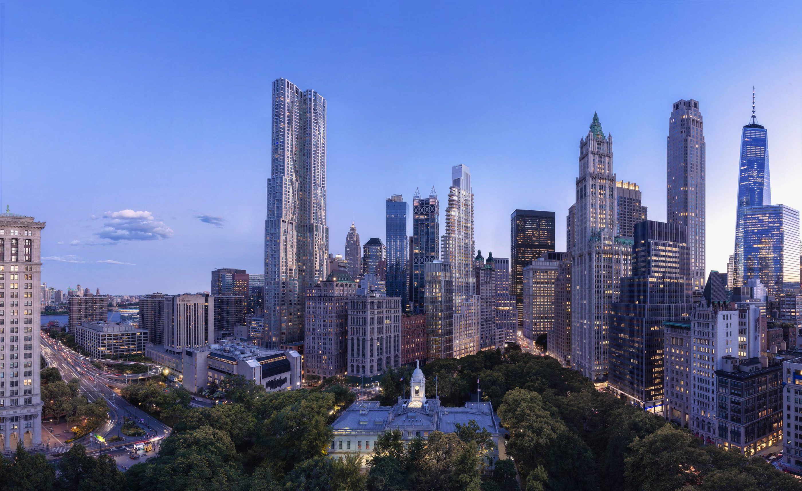
25 Park Row built its entire brand on proximity to City Hall Park. Kaiquartier has Schönbrunn Palace and the Tiergarten — a stronger card to play.
Was in der Nähe ist, gehört zur Geschichte.
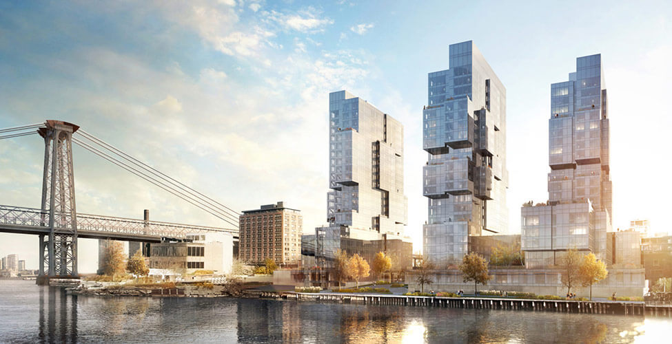
420 Kent stripped branding to the minimum and let Williamsburg waterfront do the work. If Hietzing's reputation is strong enough, restraint beats noise.
Nicht alles muss laut sein.
Front & York proved that maker spaces, co-working, and basketball courts turn a large rental into a lifestyle brand. Pool + fitness + supermarket at Kaiquartier is the same formula.
Gemeinsame Räume machen aus Wohnungen mehr.
Harry Glück put pools on the roof of Alt-Erlaa in 1976 and changed Viennese social housing forever. Kaiquartier's pool isn't a perk — it's a direct line to that legacy.
Er ist Teil der Idee.